
In a series of four articles,the newspaper Business Standard 1 See the following articles in the following issues of Business Standard: (a) Somesh Jha, ‘Consumer Spend Sees First Fall in 4 Decades on Weak Rural Demand: NSO Data’, November 14, 2019; (b) Abhishek Wagmare and Somesh Jha, ‘Are India’s Falling Consumer Spend and Strong GDP Growth in Sync?, November 15, 2019; (c) Somesh Jha, ‘Govt Scraps NSO’s Consumer Expenditure Survey Over “Data Quality”’, November 15, 2019; and (d) Somesh Jha, ‘NSO’s Junked Consumer Expenditure Survey Shows Inequality Gap Declining’, November 18, 2019. has presented a set of results based on the draft National Statistical Office (NSO) Report on Household Consumer Expenditure for 2017-18 (this is the 75th in the various Rounds of the NSO’s Consumer Expenditure surveys). The sequence of Business Standard analyses and reports presents a grim picture of trends in the levels and distribution of consumer spending in India over the period 2011-12 (when the previous NSO ‘thick’ survey on consumer expenditure was carried out and published) and 2017-18. It is hard to overestimate the value of Business Standard’s reporting on, and inferences from, the data in the 2017-18 75th Round of the NSO survey. The present article carries that project forward with some additional results and analyses relating to trends and levels of consumer expenditure in rural India. The outcome, as we shall see, is at least as grim as the findings that have been portended in the Business Standard..
In the wake of the Business Standard reports, the Government of India has decided not to release the 2017-18 draft NSO Report, apparently on grounds of the questionable quality of the data presented in it. In a Press Information Bureau release from the Ministry of Statistics and Programme Implementation (MoSPI), we are told:
… the results of the survey were examined and it was noted that there was a significant increase in the divergence in not only the levels in the consumption pattern but also the direction of the change when compared to the other administrative data sources like the actual production of goods and services. Concerns were also raised about the ability/sensitivity of the survey instrument to capture consumption of social services by households especially on health and education. The matter was thus referred to a Committee of experts which noted the discrepancies and came out with several recommendations including a refinement in the survey methodology and improving the data quality aspects on a concurrent basis. The recommendations of the Committee are being examined for implementation in future surveys… In view of the data quality issues, the Ministry has decided not to release the Consumer Expenditure Survey results of 2017-2018. The Ministry is separately examining the feasibility of conducting the next Consumer Expenditure Survey in 2020-2021 and 2021-22 after incorporating all data quality refinements in the survey process.
The MoSPI decision to withhold the 2017-18 draft NSO Report provokes at least two sorts of response. First, one can think of no good reason for not releasing the Report, even if the data contained in it are unreliable: the Government is, of course, free to question the quality of the data, and to distance itself from the findings to which the Report lends itself, but why deny the option, indeed the democratic necessity, of allowing it into the public domain? After all, the country is not wanting in economists and statisticians who have a long-standing familiarity with survey methods and protocols, and therefore the competence and expertise needed to form an independent judgement of their own on the merits of the Report! Such a viewpoint is reflected, for instance, in an open letter written by 214 scholars and addressed to the Government of India, demanding the release of the 75th Round of the NSO consumption survey (2017-18), on the grounds that ‘to prevent release of data that are adverse, and diverge from [the government's] own understanding, is neither transparent nor technically sound’. Indeed, the findings of the 2009-10 NSO consumption survey were not particularly complimentary to an assessment of economic performance in that year, and the government of the day predictably expressed reservations regarding the reliability of that survey, but without, for that reason, suppressing it.
Second, the Press Information Bureau’s communiqué (cited earlier) calls the quality of the 2017-18 survey into question by pointing to a diverging hiatus between the NSO estimates of consumption and those (presumably) of the Central Statistics Office’s National Accounts Statistics (NAS) estimates. But this is a long-standing problem, and one which is commonly encountered in the statistical data base of several countries. For all distribution-related exercises, it is now a generally accepted practice to go by survey results, while of course pointing to possible discrepancies from other data-sources (such as are reflected in the national accounts of an economy, for example). Similarly, in the matter of a possible underestimation of household spending on social services, it is not clear that the problem is peculiar to the 2017-18 Survey. It would be a different matter if the alleged deficiencies of a survey were to be shown to be uniquely and specifically applicable to that particular survey. The history of the NSO surveys on consumption spending is not wanting in such examples. In 1999-2000, the survey resorted to the use of recall periods different from the standard 30-day recall period employed in preceding surveys. It is now widely agreed by experts that even the results obtained from employing the 30-day recall period in that survey must be regarded with extreme suspicion because of possible contamination by the results obtained from employing 7-day and 365-day recall periods (see, for instance, the work of Abhijit Sen in this regard 2 AbhijitSen (2000): ‘Estimates of Consumer Expenditure and Its Distribution: Statistical Priorities after NSS 55th Round’, Economic and Political Weekly, XXXV (51): 4499-4518; and Abhijit Sen (2001): ‘Estimates of Consumer Expenditure and Implications for Comparable Poverty Estimates after the NSS 55th Round’, Paper presented at NSSO international seminar on ‘Understanding Socio-Economic Changes through National Surveys’, May 12-13, New Delhi. ).
As a result of extensive public debate, most careful scholars now would tend to ignore the 1999-2000 survey results in any time-series construction of distributional trends in consumption expenditure. It needs to be reiterated that this outcome is a product of elaborate public-domain discussion, not of unilateral governmental suppression of data.
Against this background, it is of interest to examine what the 2017-18 NSO survey on household consumption expenditure reveals, and what changes it records vis-à-vis 2011-12. This is what is attended to in the rest of this article.
1. From 2011-12 to 2017-18: Changes in Aspects of Rural Consumption
In what follows we undertake some very simple exercises in order to assess the changes in rural consumption that have occurred with respect to certain dimensions of interest in the passage from 2011-12 to 2017-18. For this purpose, we employ the 2011-12 NSO Report (68th Round:Household Consumption of Various Goods and Services in India 2011-12)and the data contained in Table T3 of the draft 2017-18 NSO Report (75th Round: Key Indicators: Household Consumer Expenditure in India).
1.1 Some Conceptual and Computational Preliminaries
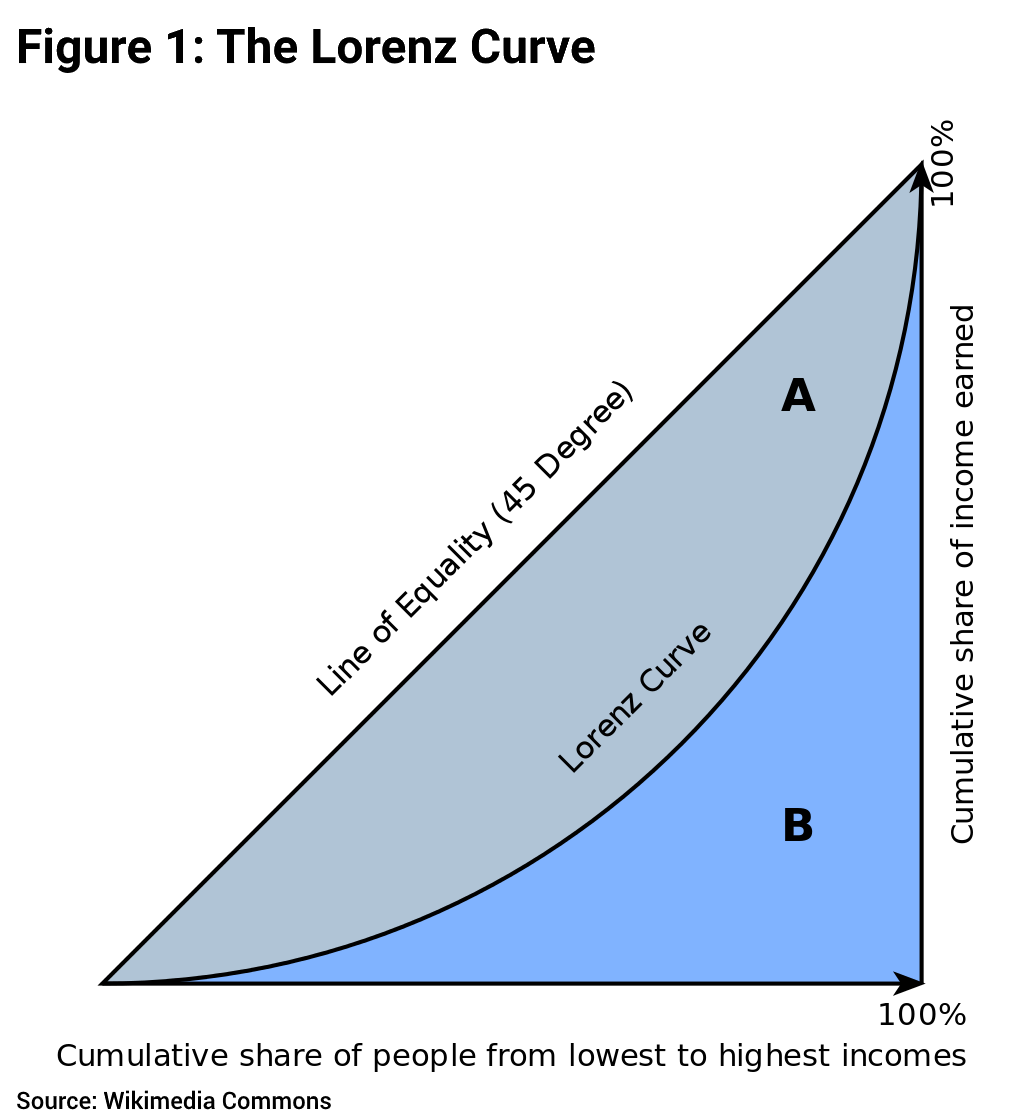
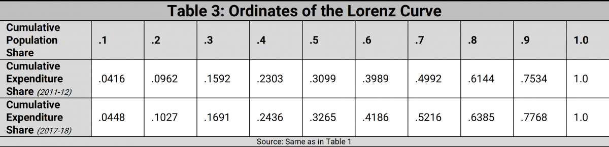
Both the 2011-12 and the draft 2017-18 NSO Reports enable us to generate data on the ordinates of the Lorenz Curve. The non-specialist reader must not be the least bit deterred by the phrase ‘the ordinates of the Lorenz Curve’: there is no great mystery embedded here! What the Lorenz Curve does is to simply arrange income or expenditure levels in ascending order, and it then marks out the poorest 10% of the population, the poorest 20% of the population, the poorest 30% of the population,…, and so on, until we take stock of the entire population (that is, the ‘poorest’ 100% of the population). The Lorenz Curve is nothing but the graph we would obtain by plotting the cumulative expenditure share against the cumulative population share for each decile (that is, each 10%) of the population.
What would the Lorenz curve typically look like? Notice that if every person had an equal share of the total expenditure in the economy, then the poorest 10% of the population would account for 10% of the total expenditure, the poorest 20% would account for 20% of the total expenditure, the poorest 30% for 30% of the total expenditure,…,and so on. The Lorenz Curve for a perfectly equal distribution of incomes or expenditures would thus simply lie along the diagonal of the unit square, as shown in Figure 1. But typically, income/expenditure is unequally distributed: the poorest 10% of the population would have a less-than-10% share of the total expenditure, the poorest 20% a less than 20% share of the total expenditure, …, and so on. (Of course, for every distribution, the poorest 100% of the population must, by definition, always have 100% of the total expenditure!) The Lorenz curve for a typical unequal distribution would then look like the curve drawn in Figure 1, a rising curve that lies below the diagonal, or ‘line of perfect equality’.
It is easy to verify visually that the area enclosed by the Lorenz Curve and the line of perfect equality is a measure of the extent of inequality in the distribution of expenditure. The lower the Lorenz curve is, the greater is this area, and therefore the greater the extent of inequality. The well-known Gini coefficient of inequality, which economists are very fond of employing, is directly related to the area enclosed by the Lorenz Curve and the line of equality. In fact, the Gini coefficient is just twice this area (marked A in Figure 1). One more thing may be noted. Suppose we have two distributions, and the Lorenz curve for the first distribution lies everywhere above the Lorenz Curve for the second distribution, that is, the first distribution ‘Lorenz-dominates’ the second one: then it is very easy to see that inequality in the first distribution must be smaller than in the second.
Anyway, once we have used the NSO reports to generate data on the ordinates of the Lorenz Curve, we can feed these data points into the computer in order to obtain a number of other results of distributional interest. I am speaking here of an enormously useful and versatile software package called POVCALNET which has been made available to practitioners by the World Bank. It is much like cramming some batter and onions into one end of a machine and obtaining a variety of pakodas and bhajias at the other end! What the software package does is to estimate the equation of the Lorenz Curve by means of what is called ‘the Beta Function’; with the estimated equation in place, a whole lot of other statistics can be routinely computed. And that is what is reviewed in what follows.
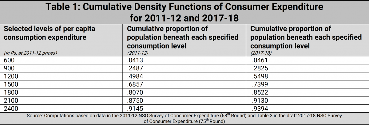
1.2 The Cumulative Density Functions for 2011-12 and 2017-18
A very useful device to employ in all distributional analysis is a graph called the ‘cumulative density function’ (cdf). Again, the nomenclature is a good deal scarier than the actual concept!A cumulative distribution function simply arranges all incomes or expenditure levels from the lowest to the highest, and then reads off the cumulative proportion of the population with incomes less than each level. We must expect, of course, that as the income levels increase, the corresponding cumulative population shares will also increase. The cdf must therefore be expected to be a curve which rises over the range of incomes in a distribution.
Now suppose we have two distributions X and Y, and that the cdf for distribution X lies everywhere below that for distribution Y. Then we can see that there is a definite sense in which distribution X reflects unambiguously more welfare than distribution Y. Why? Because starting from the lowest income or expenditure level, there is a smaller fraction of people at each income level in X than in Y: what this means, among other things, is that no matter what level of income or expenditure we employ as the poverty line, the proportion of the population in poverty (also called the Headcount Ratio or HCR for short) will always be smaller for distribution X than for distribution Y. For an economy displaying steadily unambiguous secular improvement, we must expect that in any two successive years the cdf for the latter year will lie everywhere below the cdf for the former year. This is what statisticians call ‘first-order stochastic dominance’.
In the transition from the consumer expenditure distribution of 2011-12 to that of 2017-18, do we find first-order stochastic dominance? Yes, we do — but, unhappily, in the wrong direction! That is, when we compare the cdfs of consumption expenditure for 2011-12 and 2017-18, we find that the earlier year, 2011-12, first-order stochastically dominates the latter year, 2017-18. This is the first time in decades that such a phenomenon has occurred, and the nature of the problem is manifestly evident from the numbers in Table 1.
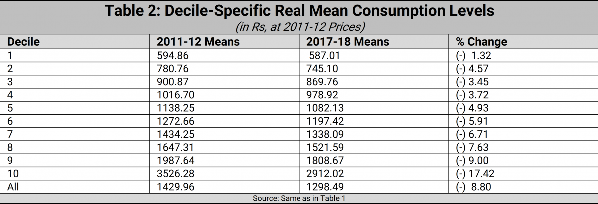
1.3 Decile-Wise Per Capita Mean Consumer Expenditure Levels: 2011-12 and 2017-18
Table 2 presents information on the levels of average consumption expenditure in each of the deciles, arranged from the lowest to the highest, for each of the years 2011-12 and 2017-18. Alarmingly, Table 2 suggests that every single decile has lost out in the transition from 2011-12 to 2017-18. The ‘growth incidence curve’ is a device which tells us the rate of growth of average consumption expenditure for each decile of the population. It can be plotted from the last column of Table 2, though we don’t actually do that here since the numbers in the column in question speak very clearly for themselves. For every decile, the rate of growth is negative; and the growth incidence curve of column 4 of Table 2 shows that the richest decile’s mean has declined the most in proportionate terms. But what is really hurtful for the condition of the poor is that the already low average consumption levels of the poorest deciles have declined even further in the period under review.
1.4 Inequality in the Distribution of Consumer Expenditure: 2011-12 and 2017-18
As we have already seen in Section 2.1, the Lorenz Curve could give us a very good idea of how inequality might have changed across space or over time. Accordingly, Table 3 presents information on the ordinates of the Lorenz curve for each of the years 2011-12 and 2017-18. More precisely, it presents, for each of the reference years, the cumulative expenditure shares for each of the poorest 10%, 20%, 30%,…, and so on of the population. As it happens, and as Table 3 reveals, the 2017-18 distribution Lorenz-dominates the 2011-12 distribution. That is to say, inequality must be deemed to have unambiguously declined from 2011-12 to 2017-18. Is this, then, at last a glimmer of sunlight in an otherwise bleak landscape?
Regrettably not. For how has the diminution in inequality taken place? Through a particularly harsh form of what the philosopher Derek Parfit 3
has called ‘levelling down’, namely achieving greater equality not by raising the disadvantaged to the status of their relatively advantaged brethren, but by lowering the standards of the relatively advantaged population to those of the disadvantaged sections of society. What we have on evidence is, as just stated, a particularly harsh form of ‘levelling’ down: it is not just that the better-off have been levelled down to the status of the worse-off; it is that both the better-off and the worse-off have been brought down, with the relatively advantaged population’s average incomes declining even more sharply than those of the relatively disadvantaged population. This is not ordinary levelling down, it is levelling down with a vengeance!
1.5 A Consolidated Account of Changes in Welfare, Inequality, and Poverty
Table 4 presents a summary picture of various indicators of welfare, inequality and poverty.
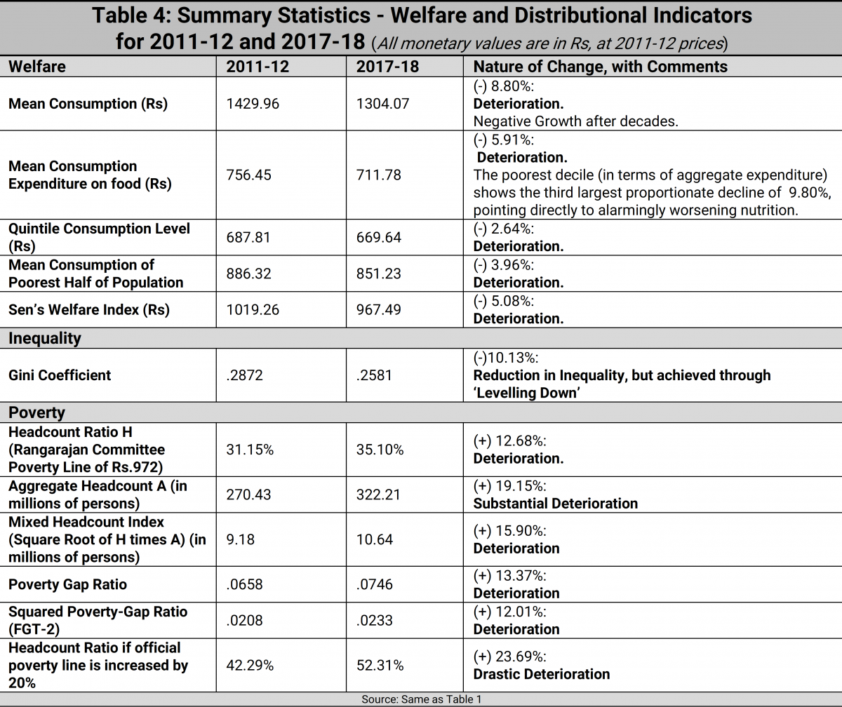
The figures in Table 4 are largely self-explanatory, and therefore require minimal commentary, at best. Over 2011-12 to 2017-18, each of the following welfare indicators has registered a decline: average per capita consumption expenditure; average per capita expenditure on food, with grave implications for a rise in hunger among the poorest of the poor; Kaushik Basu’s welfare-cum-poverty indicator, the quintile expenditure statistic 4 Kaushik Basu (2001): ‘On the Goals of Development’. In G.M. Meier and J.E.Stiglitz (eds), Frontiers of Development Economics: The Future in Perspective, Oxford University Press: New York. (or average expenditure of the poorest 20% of a population); the average income of the below-median population; and Sen’s Welfare Index, which is the mean expenditure ‘adjusted’ for distributional considerations via the Gini coefficient of inequality.
Insofar as inequality is concerned, the Gini coefficient has declined in value, and that might seem to be a good thing. But as noted earlier, it is always a prudential virtue to interpret movements in social indicators not only in terms of outcomes, but in terms of the processes leading to these outcomes. In the matter of the inequality change from 2011-12 to 2017-18, we are actually looking—as we have suggested earlier—at a particularly harsh form of ‘levelling down’ which no self-respecting egalitarian is likely to approve of.
Finally we come to a set of poverty indicators. Employing the modest Rangarajan Committee poverty line of a monthly per capita expenditure level of Rs.972, we find that the headcount ratio, or proportion of the population in poverty, has climbed up from 31% to 35%, thus inverting a long trend of declining poverty ratios. If the poverty line is raised by 20% to a less modest but still modest level, then we find that the HCR (see the last row of Table 4) rises precipitously from 42% to 52%. More sophisticated measures of poverty than the headcount ratio, such as the poverty-gap ratio (or per capita shortfall of the average income of the poor from the poverty line), and the squared poverty-gap ratio (which also incorporates distributional considerations in the measurement of poverty) have displayed comparable rates of deterioration. Of interest, from the point of view of the extent to which resources for poverty-alleviation must be stretched, is not only the headcount ratio, but also the absolute headcount (or numbers of people in poverty). This statistic has increased drastically--from 380 million persons in poverty in 2011-12 to 456 millions in 2017-18. Finally, a poverty index which gives equal weight to both the proportion and the absolute size of the population is a ‘mixed headcount index’, given by the square-root of the product of the two quantities: this indicator too displays an increase in value.
2. Concluding Observations
An analysis of the distributional data in the 2017-18 draft NSO Report, and reviewed above in a comparative assessment vis-à-vis 2011-12, suggests a significant deterioration in levels of rural welfare and poverty, and a decline in inequality of the sort which can fulfil no sensible egalitarian aspiration. Interestingly, these are the sorts of results that one would expect to be compatible with two widely acknowledged disasters of policy intervention in the recent past—the demonetisation exercise and a shoddily implemented goods-and-services tax ‘reform’. This is a major circumstantial reason for entertaining some scepticism about the view that there is something seriously wrong with the data in the 75th Round draft Report. Even so, it cannot be anyone’s dogmatic claim that these data are above reproach. So why not give all of us a chance to assess the quality of the data?
Failing that, one cannot be blamed for placing credence in a variant of Benjamin Disraeli’s famous dictum on lies, namely, that there are three kinds of truths: truths, damning truths, and statistics.
(An earlier version of this article had a few wrong values in Table 4. These have been corrected. The errors are regretted.)