
The principal—indeed virtually only—source of data available to the analyst to track outcomes relating to the size, distribution and pattern of consumption expenditure in India is the National Sample Survey Office’s (NSSO’s) once-in-five-years survey on household consumption. The last officially available survey dates back to 2011-12. A subsequent survey pertaining to the year 2017-18 turned out to be an ill-fated one: it revealed a decline in average per capita consumption and an overall increase in the poverty headcount ratio; and it was (accordingly?) junked by the Government of India as being unreliable. We have had to wait for over a decade from 2011-12 to have the next survey, some results of which have been summarized in a ‘Fact Sheet’ 1Household Consumption Expenditure Survey: 2022-23 Fact Sheet. Available at: https://www.mospi.gov.in/sites/default/files/publication_reports/Factsheet_HCES_2022-23.pdf?download=1 put out by the Department of Statistics and Programme Implementation.
Overdue though the present survey is, most economists with a concern above all for the timely availability of more or less accurate official data on the economy have not exactly been holding their breath in anticipation of its arrival. The experience over the last decade with official attitude toward official data, in the matter of either punctuality of release or toleration of content, has not been such as to fill the analyst’s heart with hope and expectation. A part of that experience is reflected in the delay in the release of the 2017-18 Periodic Labour Force Survey report which carried information on a record level of unemployment in India; in the non-existence of a decennial Census after 2011; in the suppression of the NSSO’s 2017-18 survey on consumption expenditure; and in the suspension and eventual resignation of the International Institute of Population Science’s Director, which presumably had nothing to do with the National Family Health Survey-5’s unflattering data on open defecation, anaemia and access to cooking fuel 2Kaur, B (2023): “‘'Unhappy With Data Sets,' Modi Govt Suspends Director of Institute Which Prepares NFHS,” The Wire.in, 28 July, 2023. https://thewire.in/government/ks-james-nfhs-modi-government-data-sets-iips .
Given all of this, it would have been a cause for any economic analyst to fall off their chair if the first officially accepted NSSO survey on consumption expenditure after 2011-12 did not rectify the depressing picture painted by the impugned 2017-18 survey. And nor has any such unhappy accident been reported after the release of the 2022-23 survey’s Fact Sheet. Analysts by now have got accustomed, over the last three decades or so, to consumption survey reports revealing stagnant or mildly increasing inequality levels in the distribution of consumption expenditure, along with growth in average per capita consumption which percolates down to the poorest segments of the population. These are trends which are compatible, given the rules of arithmetic, with a steady decline in poverty headcounts calculated with the absurdly low and (unchanging constant-price) poverty lines put out by various Expert Groups of the Planning Commission or by the World Bank. So it has largely been a matter of chugging tiredly along on expected lines.
Even so, when there are things happening in the economy (demonetisation, GST, Covid) which disrupt business-as-usual, then one might expect the data (in normal circumstances) to reflect a sobering story of welfare, inequality and poverty. This is not the story, as will be spelt out in this article, which is told by the 2022-23 Household Consumption Expenditure Survey (HCES). But these are not normal times; one is immured; and one does not fall off one’s chair. Still, one may be excused for sitting up a little and taking notice, if only to register the contrast between what the facts on the ground and the data in the survey seem to suggest. This is the least a commentator may be expected to do, and constitutes the restricted purpose of this essay.
Before proceeding further, a major caveat is in order. In comparing welfare, inequality and poverty outcomes in 2011-12 with those in 2022-23, a major premise is that the consumption surveys in the two periods are comparable. There is, however, reason to doubt the validity of this premise, as has been explicitly noted in the HCES Fact Sheet itself, which draws attention to problems of comparability arising from changes in the questionnaire, in the coverage of consumption items, in the multiplicity of visits for data collection, and in the mode of data collection. There would also appear to have been significant changes in the sampling strategy adopted. These issues have been discussed elsewhere, and in some detail, by Santosh Mehrotra and Rakesh Ranjan Kumar 3Mehrotra, S. and R. R. Kumar (2024): ‘Why the 2023 Consumption Survey is Not Comparable with Previous Rounds,’ The Wire.in, 27 February, 2024. https://thewire.in/economy/why-the-2023-consumption-survey-is-not-comparable-with-previous-rounds who suggest, among other things, that the sampling procedure employed may be such as to have under-represented the poorer among poor consumers. Without access to the full report of the survey (which is still pending), it is impossible to tell (a) whether the survey methodology for 2022-23 is superior to the methodology in earlier surveys, and (b) whether there exist any conceivable ‘adjustments’ to the data whereby comparability may be improved. Nevertheless, it is useful to compare the results for 2011-12 with those for 2022-23 from this restricted perspective: if the results suggest changes in welfare, inequality and poverty which do not sit well with what we know of other tendencies in the economy, then we must conclude that either the two surveys are radically non-comparable (in which case nothing can be said about improvements or deteriorations over time), or the data in the present survey are unreliable—for methodological or other reasons. A comparison of 2011-12 with 2022-23 is therefore not without its uses.
The analyses carried out in the ensuing sections of this article could come across as being a bit technical for the reader who is not a professional economist. To such a reader, I offer my sincere apologies, but would also like to point out that I have tried to explain the concepts I have employed as simply as I have been able to.
Welfare
Per Capita Average Consumption Expenditure
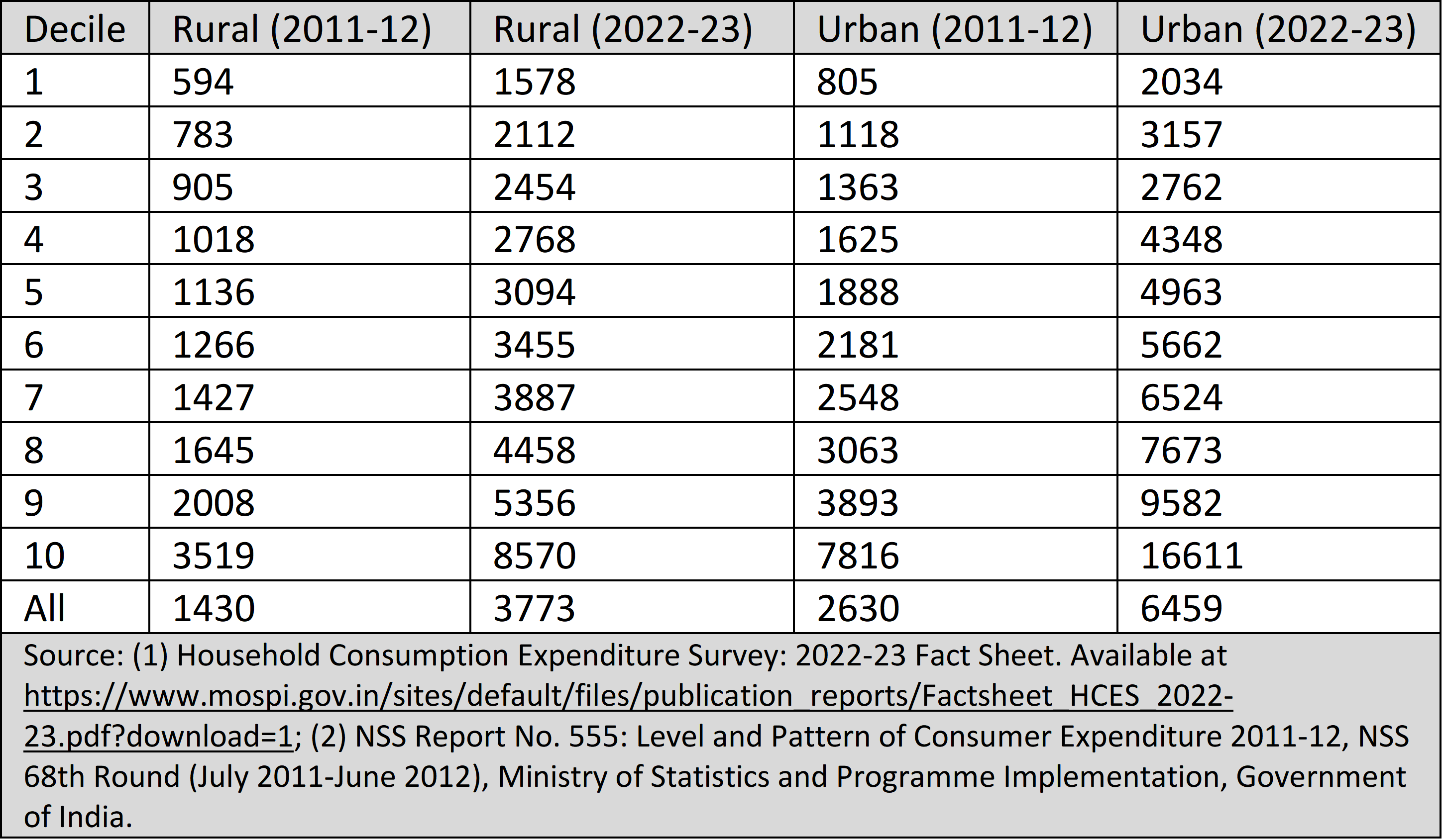
Economists have conventionally (and in an admittedly blinkered way) tended to regard the size of per capita average consumption expenditure as a reasonable indicator of ‘money-metric welfare’, and there will be no wild departures from this convention in what follows. The Fact Sheet of the HCES 2022-23 presents data on the distribution of per capita average consumption expenditure across the deciles (that is, across each 10 per cent segment) of the population, for each of the rural and urban areas of the country. For comparability, we use a similar decile-grouped presentation of the data from the 2011-12 NSO consumption survey (the distribution employed being the one valid for the so-called ‘modified mixed recall period’).
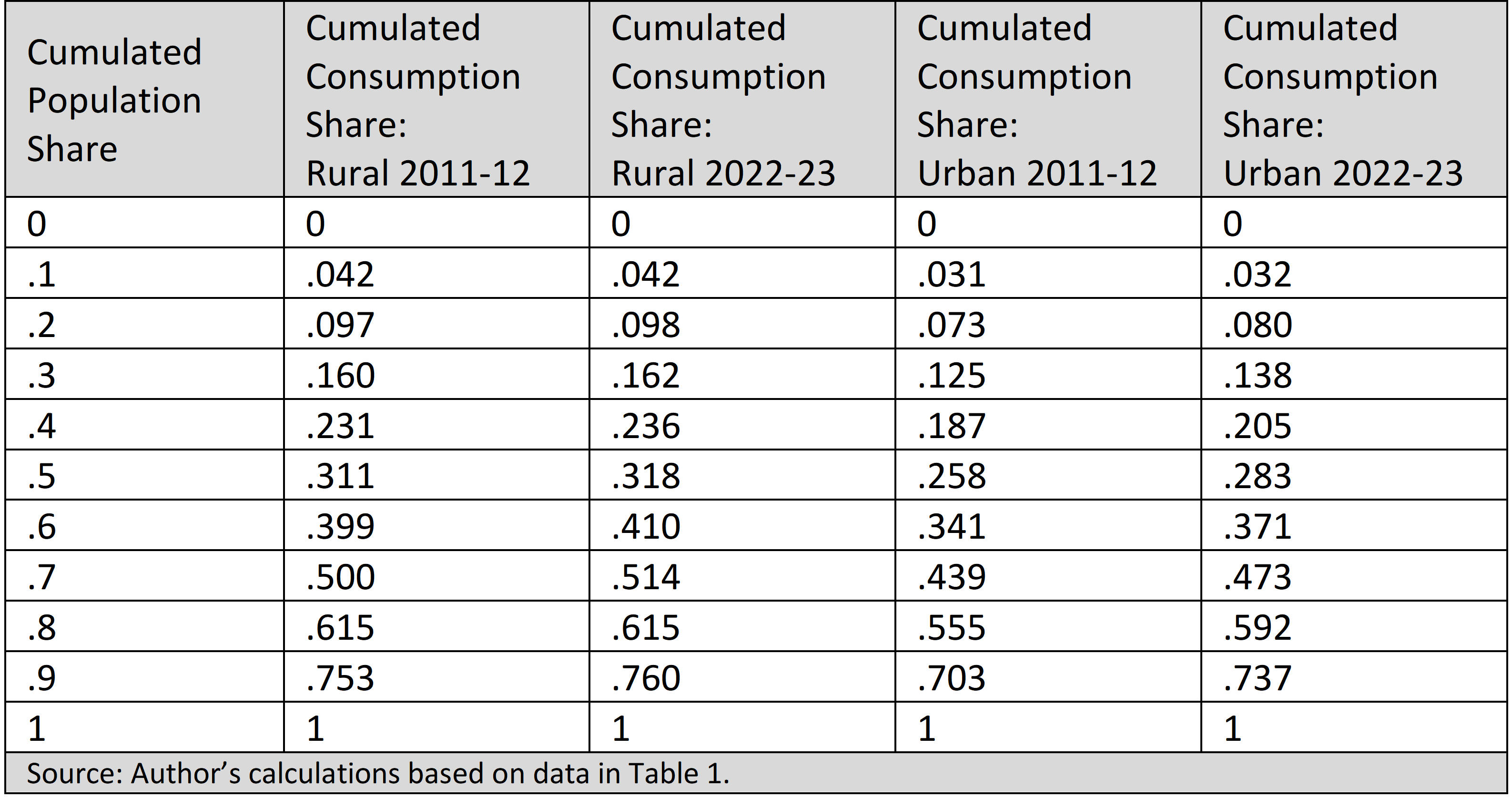
It should be mentioned that the HCES 2022-23 presents two distributions, one in which the cost of goods and services received free from various welfare programmes is imputed, and one in which it is not. To secure a measure of comparability with the 2011-12 data, the distribution we employ is the one without imputation. The relevant information is summarized in Table 1.
Table 1: Grouped Decile Data on Per Capita Average Consumption in Rupees at Current Prices: 2011-12 & 2022-23
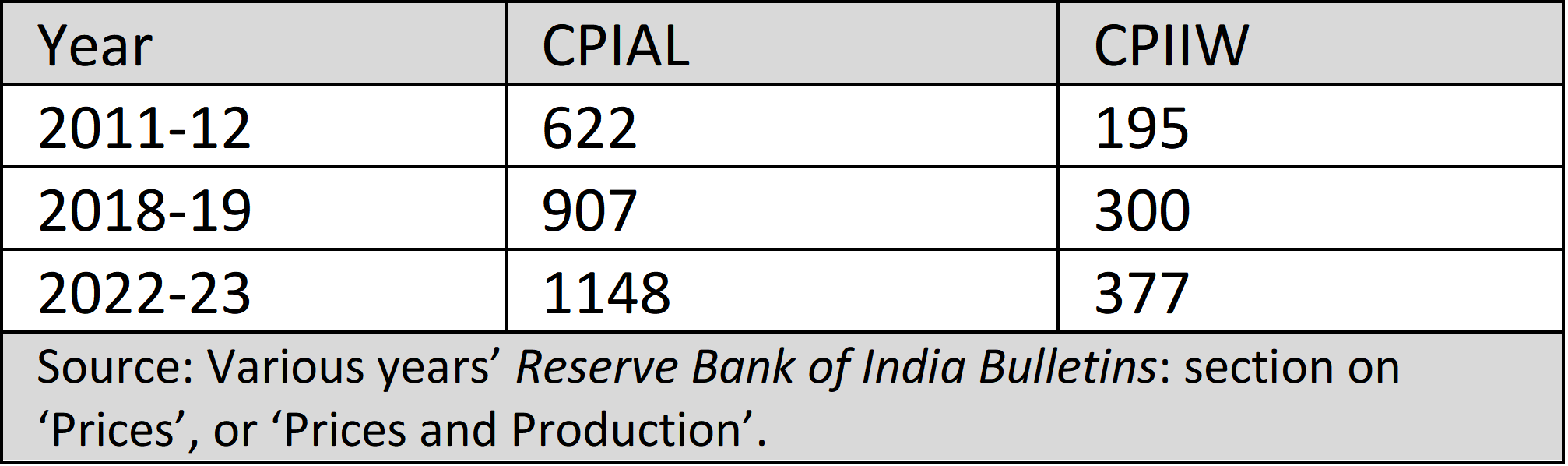
In Table 1, consumption expenditure levels have been presented in nominal terms: in order to be able to compare these figures over time, we need to correct them for changes in the price level. This would require the employment of a suitable price index. In line with convention, we employ the Consumer Price Index for Agricultural Labourers (CPIAL) as the appropriate price deflator for the rural areas, and the Consumer Price Index for Industrial Workers (CPIIW) as the relevant index for the urban areas. Using these, nominal expenditure levels for 2022-23 can be expressed at 2011-12 prices. The values of the price indices employed are provided in Table 2. (We also provide the price indices for the year 2018-19, as these are required, at a later, stage, for poverty computations.)
Table 2: Consumer Price Index for Agricultural Labourers (CPIAL) and Consumer Price Index for Industrial Workers (CPIIW) with 2000-01 as Base: 2011-12, 2018-19, 2022-23
Using the price indices provided in Table 2, Table 3 presents the decile-wise average per capita consumption expenditure figures for 2011-12 and 2022-23 at 2011-12 prices, and also indicates the annualized compound rate of growth of consumption over the 11-year period 2011-12 to 2022-23 for each decile and on the aggregate.
Table 3: Grouped Decile Data on Per Capita Average Consumption in Rupees at 2011-12 Prices: 2011-12 & 2022-23
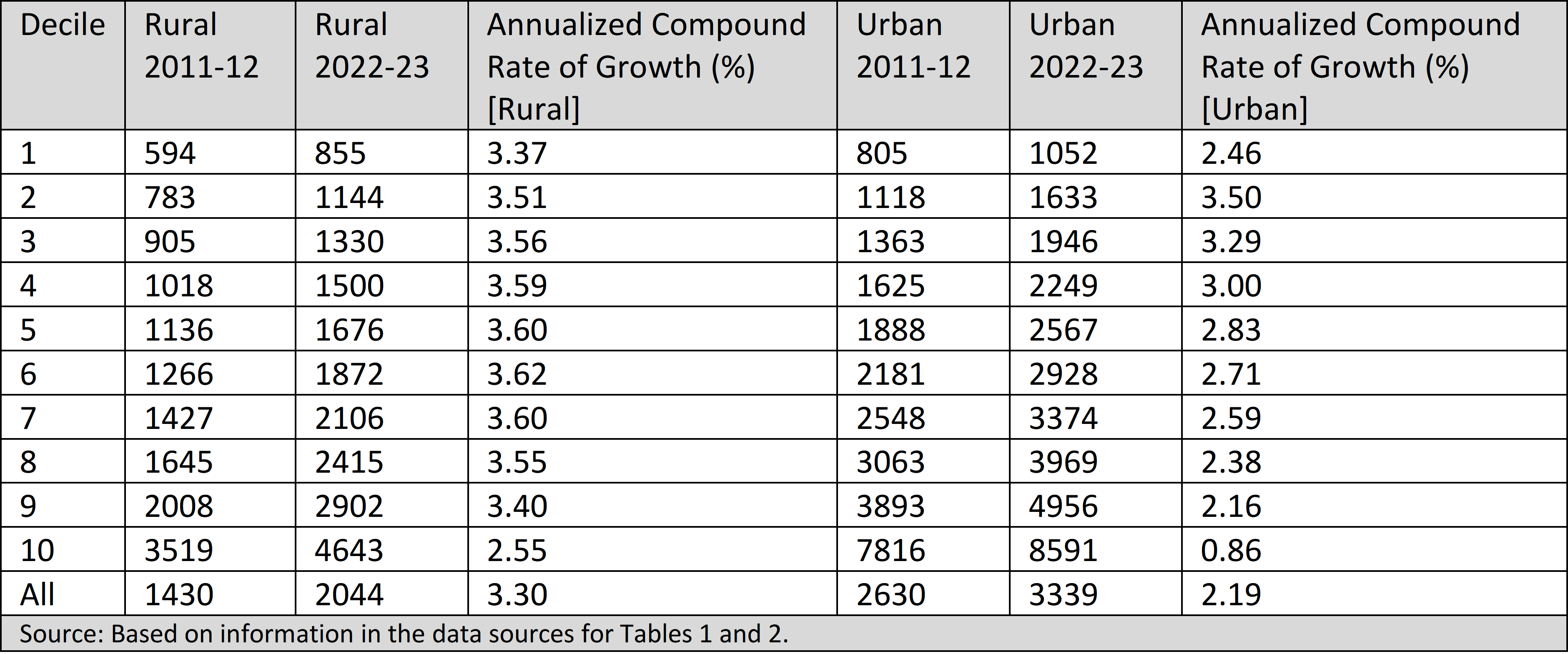
Table 3 suggests that every decile, in each of the rural and urban areas, has experienced an increase in per capita average consumption over the period 2011-12 to 20122-23. By this reckoning, welfare has definitely improved.
The Quintile Income Statistic
Kaushik Basu has proposed a welfare indicator which he calls the ‘quintile income statistic’ 4Basu, K. (2001): ‘On the Goals of Development’. In G.M. Meier and J.E.Stiglitz (eds), Frontiers of Development Economics: The Future in Perspective, Oxford University Press: New York. : this is just the average income or consumption expenditure of the poorest 20 per cent of a population, and places emphasis on identifying the welfare of a society with that of its worst-off or poorest members.
By this reckoning, welfare has improved most impressively from 2011-12 to 2022-23, if one accepts the 2022-23 survey data at face value: the quintile consumption has increased in rural India from Rs.689 to Rs.1000 at 2011-12 prices, with the quintile consumption as a proportion of the Rangarajan Committee rural poverty line (Rs.972 at 2011-12 prices) increasing from 71 per cent to 103 per cent; and in the urban areas, the quintile consumption has increased from Rs.962 to Rs.1342 at 2011-12 prices, and as a proportion of the Rangarajan Committee urban poverty line (Rs.1407 at 2011-12 prices), it has increased from 68 per cent to 95 per cent. These figures represent a huge achievement for the poorest members of Indian society who, in recent years, have been mainly in the news for their struggles in combating the consequences of demonetisation and Covid. I leave it to the reader to judge how plausible are the implied improvements in the quintile consumption statistic.
Sen’s Welfare Measure
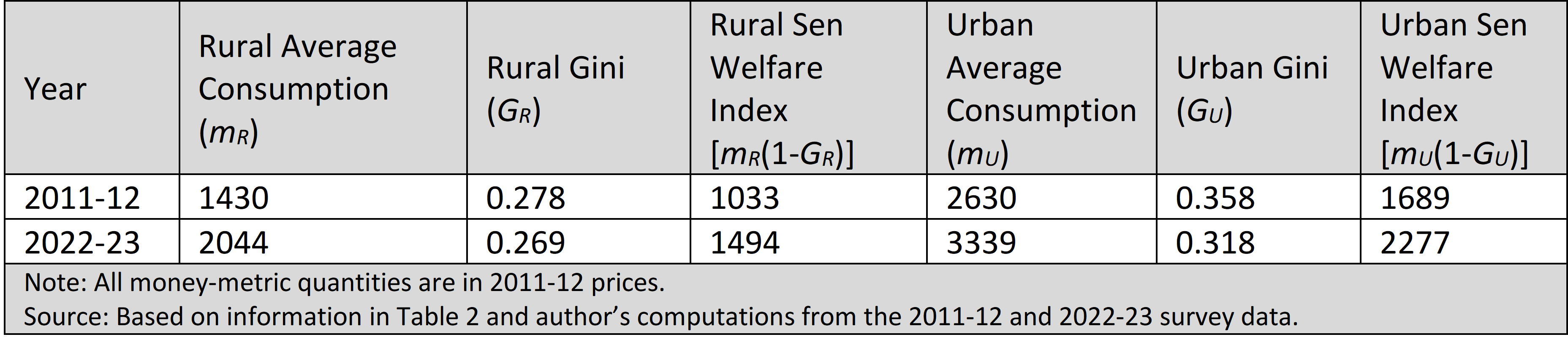
A well-known measure of aggregate welfare, due to Amartya Sen 5Sen, A. K. (1976): ‘Real National Income,’ The Review of Economic Studies, 43(1): 19-39. , is one which takes account not only of the level of average income but also of the extent of inequality in its distribution. For any given level of average income, welfare would be lower the greater the extent of inequality in its distribution, and for any given level of inequality, welfare would be lower the lower the level of average income. A measure which takes account of both ‘size’ and ‘distribution’ is Sen’s Welfare Index, expressed as the average income deflated by inequality as measured by the well-known Gini coefficient of inequality. Specifically, if m stands for average income and G for the Gini coefficient (which ranges from 0 to 1), Sen’s Welfare Index is given by the quantity m(1-G). Computations using the 2011-12 and 2022-23 survey data suggest that over the two survey periods the Gini coefficient of inequality has declined in both rural and urban India. We already know from Table 2 that real per capita average consumption has increased over this period; a decline in the one and an increase in the other reinforce each other to create a ‘double-whammy’ effect for the Sen Welfare Index, as revealed by the figures in Table 4. Again, I leave it to the reader to judge if their reading of events in the recent history of India’s economic development is compatible with such a benign description of the trend of welfare in the country.
Table 4: Average Consumption, Gini Coefficient of Inequality, and Sen’s Welfare Index for Rural and Urban India: 2011-12 & 2022-23
Changes in the Cumulative Distribution Functions
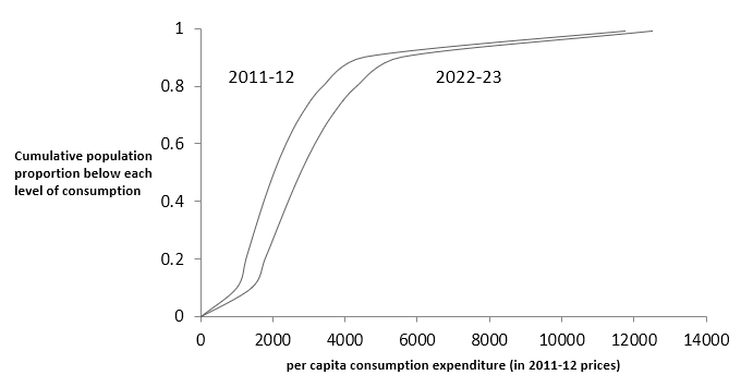
The cumulative distribution function (CDF) is a commonly employed statistical tool for reading changes in the size distribution of income. It is simply a graph which shows, for every level of income, the cumulative proportion of the population with incomes below that level. As the income level increases, clearly the cumulative fraction of the population with income below that level will increase: the CDF, that is, is an upward sloping curve. What would it mean if we had CDFs for two periods in time—call these CDF1 and CDF2 respectively—such that CDF2 lies everywhere below CDF1? This is equivalent to saying that at any given level of income, the proportion of the population below that level is smaller in period 2 than in period 1; or, flipping it around, for any cumulated fraction of the population, the income level which cuts off that fraction is higher in period 2 than in period 1. In either interpretation, the meaning of CDF2 lying everywhere below CDF1 is clear: if income is an indicator of welfare, then welfare is unambiguously higher in period 2 than in period 1. This is a case of what statisticians call first-order stochastic dominance. First-order stochastic dominance is a very good indicator of unambiguous welfare-superiority!
In Table 5, we have calculations that show the consumption expenditure level that cuts off the poorest 10 per cent of the population, the poorest 20 per cent,…and so on up to the poorest 99 per cent, for each of the rural and urban areas of the country, in each of the years 2011-12 and 2022-23. These are just the relevant period-and-sector CDFs. The data in Table 5 have been plotted in Figures 1 and 2 for rural and urban India respectively, so as to furnish a clear visual picture of what has happened to the rural and urban CDFs of consumption expenditure in the passage from 2011-12 to 2022-23. The table and the figures reveal a clear case of first-order stochastic dominance for 2022-23 over 2011-12, suggesting an unambiguous welfare improvement for both the rural and the urban areas of the country. The rightward shift of the rural CDF is particularly well-marked (Figure 1). First-order stochastic dominance over time is not necessarily uncommon in a growing economy with some trickle-down—but in an economy with growth reversals and a recent experience of both policy failures and a disruptive pandemic? For the reader, again, to judge!
Table 5: Rural and Urban Cumulative Distribution Functions of Consumption Expenditure in 2011-12 & 2022-23
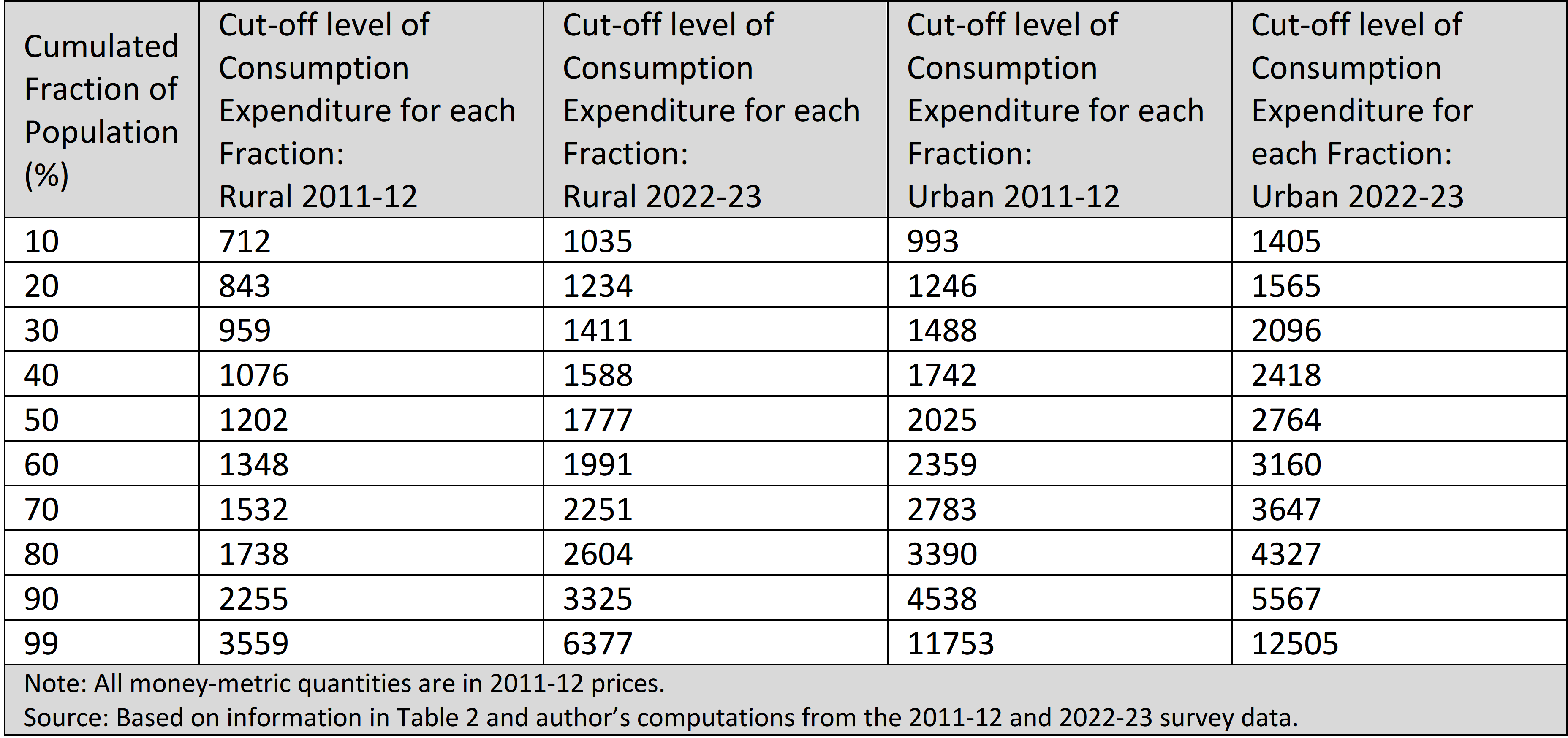
Figure 1: Cumulative Distribution Functions of Consumption Expenditure for Rural India: 2011-12 & 2022-23
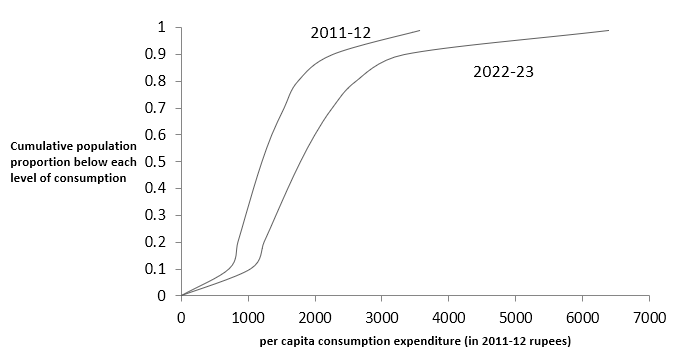
Figure 2: Cumulative Distribution Functions of Consumption Expenditure for Urban India: 2011-12 & 2022-23
Inequality
The Gap between the Top and Bottom Deciles
A simple but revealing measure of inequality is obtained by comparing the income (or consumption) status of the richest section of a population with the income status of the poorest section—an approach largely associated with the work of José Gabriel Palma 6Palma, J. G. (2011): ‘Homogeneous Middles vs. Heterogeneous Tails, and the End of the “Inverted-U”: The Share of the Rich is What It’s All About’, Development and Change, 42 (1), pp. 87–153. . For specificity, one could employ a summary measure given by the ratio of the average income of the richest decile to that of the poorest decile. Call this the ‘top-10-to-bottom-10 ratio’. Information on this ratio for the rural and urban consumption expenditure distributions of 2011-12 and 2022-23 is available from the data already presented in Table 1. It can be seen from the relevant figures in Table 1 that the ‘top-10-to-bottom-10 ratio’ has declined for both rural and urban India: from 5.9 to 5.4 in the rural areas, and very steeply (and intriguingly) from 9.7 to 8.2 in the urban areas. It is hard to fathom what measure of policy or nature might have brought this about.
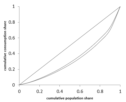
Changes in the Lorenz Curve
The Lorenz curve is the contrivance most commonly employed by economists to assess and measure inequality. It is obtained by plotting the cumulated income share of each cumulated proportion of the population, arranged in ascending order of income. If the poorest 10 per cent of the population account for 10 per cent of the total income, the poorest 20 per cent for 20 per cent of the total income, … and so on, we would have a case of perfect equality in the distribution of income, and the Lorenz curve would be represented by a straight line which is the diagonal of the unit square. A typical unequal distribution would be represented by a Lorenz curve that lies beneath the diagonal. The area between the diagonal and a Lorenz curve is a ‘natural’ measure of the ‘distance’ between a hypothetical equal distribution and the actual unequal distribution one is dealing with, and this area distance measure is closely related to the Gini coefficient of inequality, which ranges from zero (no inequality) to one (complete concentration of all income with a single person). If the Lorenz curve of one distribution lies completely above that of another, then the first distribution is said to Lorenz-dominate the second. Lorenz dominance reflects a case of unambiguously lower inequality, since if one Lorenz curve lies everywhere above another, then the first curve is everywhere, and unambiguously, closer to the diagonal line of perfect equality.
What can we say about the Lorenz curves of consumption expenditure in 2011-12 and 2022-23? Based on the data presented in Table 1, it is possible to generate the ordinates of the Lorenz curve, that is, to specify the consumption share of the poorest 10 per cent of the population, the poorest 20 per cent, …and so on. This information is presented in Table 6, for both rural and urban India, and for each of the survey years 2011-12 and 2022-23.
Table 6: Ordinates of the Lorenz Curve: Rural and Urban India, 2011-12 & 2022-23
One can see from Table 6 that the distribution for 2022-23 Lorenz-dominates that for 2011-12, in both rural and urban India. Figures 3 and 4 present the corresponding visual impressions. The Lorenz dominance of the 2022-23 distribution over the 2011-12 distribution—signifying unambiguously less inequality in the former year—is particularly clear for urban India (Figure 4). These findings regarding the Lorenz curves are corroborated by the values of the relevant Gini coefficients. We have already noted earlier that the rural Gini has declined from 0.278 to 0.269, and the urban Gini—precipitously—from 0.358 to 0.318. This finding for urban India is at particularly strong odds with a prior history of at least a mildly increasing trend in the urban Gini across NSO surveys over time.
Figure 3: Lorenz Curves for the Distribution of Consumption Expenditure in Rural India: 2011-12 & 2022-23
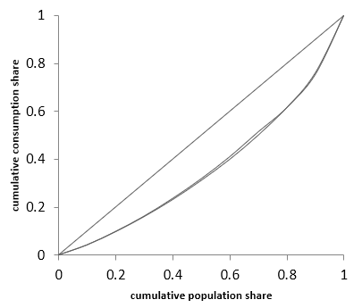
Figure 4: Lorenz Curves for the Distribution of Consumption Expenditure in Urban India: 2011-12 & 2022-23
Growth Incidence Curves
A growth incidence curve is a device, proposed by Martin Ravallion and Shaohua Chen 7Ravallion, M. and S. Chen (2003). ‘Measuring Pro-Poor Growth,’ Economics Letters, 78(1): 93-99. , for analysing the distribution of income growth rates across equal fractiles of a population. Thus, for instance, if we divide the population into deciles and calculate the rate of growth of average per capita consumption for each decile, we would be able to obtain a picture of how equal or unequal has been the distribution of growth rates across the deciles. If the growth incidence curve, which is just the plot of decile-specific growth rates against the deciles, is a downward-sloping one (signifying that the growth rate is higher the poorer the consumption decile), then clearly we have a picture of equitability in the distribution of growth, and the other way around if the curve is upward-sloping. In practice, however, one can have other patterns of the distribution of growth, with corresponding growth incidence curves which are neither uniformly downward-sloping nor upward-sloping.
It is instructive to consider the growth incidence curve for urban India over the period 2004-05 to 2011-12. Based on data in the NSO surveys of consumption expenditure for these two periods, S. Subramanian and Mala Lalvani 8Subramanian, S. and M. Lalvani (2018): ‘Poverty, Growth, Inequality: Some General and India-Specific Considerations,’ Indian Growth and Development Review, 11(2): 136-151. have calculated decile-specific compound annualized rates of growth in average consumption for urban India over the 11-year period from 2004-05 to 2011-12. The resulting growth incidence curve is as featured in Figure 5.
Figure 5: Growth Incidence Curve of Consumption Expenditure for Urban India: 2004-05 to 2011-12
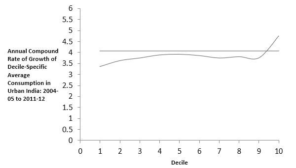
The horizontal line in Figure 5 represents the growth incidence curve that would have obtained if all deciles had grown at the same rate as the average per capita consumption of the entire distribution. It is instructive to note that the growth incidence curve rises over roughly the first four deciles, is ‘flattish’ thereafter up to the ninth decile, and shoots up in the tenth decile; furthermore, it is only in the tenth decile that the curve lies above the line for the average rate of growth. This is the sort of incidence curve that should hold few surprises for anyone acquainted with an economy, such as urban India’s, which is a site of growing inequality.
It is interesting, against this background, to consider the growth incidence curves for rural and urban India over the period from 2011-12 to 2022-23. Data on the decile-specific growth rates of per capita consumption—calculated as annualized compound rates of growth over an eleven-year period—are available in Table 3. Using these data, one can obtain the growth incidence curves for each of the rural and urban areas over the period from 2011-12 to 2022-23, and these are displayed in Figures 6 and 7.
Figure 6: Growth Incidence Curve of Consumption Expenditure for Rural India: 2011-12 to 2022-23
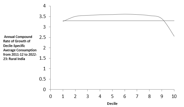
Figure 7: Growth Incidence Curve of Consumption Expenditure for Urban India: 2011-12 to 2022-23
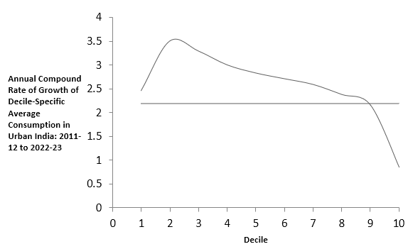
The growth incidence curves in Figures 6 and 7 are completely different from the curve of Figure 5. For rural India over 2011-12 to 2022-23, the growth rate for the poorest decile lies above the overall average growth rate, after which the growth rate rises gradually up to the sixth decile, and declines thereafter, registering a rate of growth for the richest decile which is less than the overall average growth rate. The picture for urban India (Figure 7) is even more dramatic, displaying, as it does, a precipitous drop in the growth incidence curve in the tenth decile, for which the rate of growth is just a little over a third of the rate of growth of the poorest decile! It is hard to associate such orders of implied growth-inclusivity with the development experience of this country over the last decade. Or not, depending on one’s point of view: on the message conveyed by the HCES Survey of 2022-23, the Executive Officer of NITI Aayog is quoted by The Hindu 9Vikas Dhoot (The Hindu, February 26, 2024): ‘Poverty levels below 5%, claims NITI Aayog chief.’ as saying,: “The big picture is, there is a sharp rise in urban and rural consumption by over 2.5 times from 2011-12 in current prices, and the big story is that India’s growth is not restricted to a few, but is very broad-based.” Whatever one’s differences, it should certainly be possible to agree that this is indeed a big story.
Poverty
It is customary to measure poverty in terms of the twin exercises of ‘identification’ and ‘aggregation’. ‘Identification’ consists in identifying the poor by reference to a ‘poverty line’, which is a level of income (or consumption expenditure) such that those below the line are certified as being poor. ‘Aggregation’ consists in putting together information on the poverty line and the distribution of income (or consumption expenditure) in order to come up with a single number that is supposed to specify the extent of poverty that obtains for the given combination of poverty line and distribution. The simplest measure of poverty available is the headcount ratio, or proportion of the total population identified as poor.
In comparing poverty over time, one has to correct for price changes, which would require the employment of some appropriate price deflator. In Indian poverty studies, it is conventional to express the chosen poverty line in current prices by means of the Consumer Price Index of Agricultural Labourers (CPIAL) for the rural areas of the country, and by means of the Consumer Price Index of Industrial Workers (CPIIW) for the urban areas. We have already encountered these price indices and their values for 2011-12 and 2022-23 in Table 2 of this essay. The results of inter-temporal poverty comparisons are crucially dependent on the accuracy with which the price index employed captures inflation, on the distribution used, and on the poverty line pressed into service. We should be wary of price indices that understate inflation, of distributions which overstate the incomes and income-shares of the poorer income-groups, and poverty lines which understate the income required for an adequate standard of living.
As stated earlier, it has been customary to employ the CPIAL and CPIIW for expressing poverty lines at current prices, and we shall stick to that convention. We have already seen that the 2022-23 HCES survey suggests an unambiguous reduction in inequality vis-à-vis 2011-12 which by itself, with no change in average consumption expenditure, should show a decline in the headcount ratio of poverty; combined with the relatively robust growth rates experienced by the poorer groups, as reflected in the 2022-23 survey, the stage is set for a sizeable reduction in poverty. These prior considerations would be buttressed if the poverty line employed is a relatively small one: with low poverty lines, headcount magnitudes tend to be small and trend declines in the poverty ratio tend to be flattering.
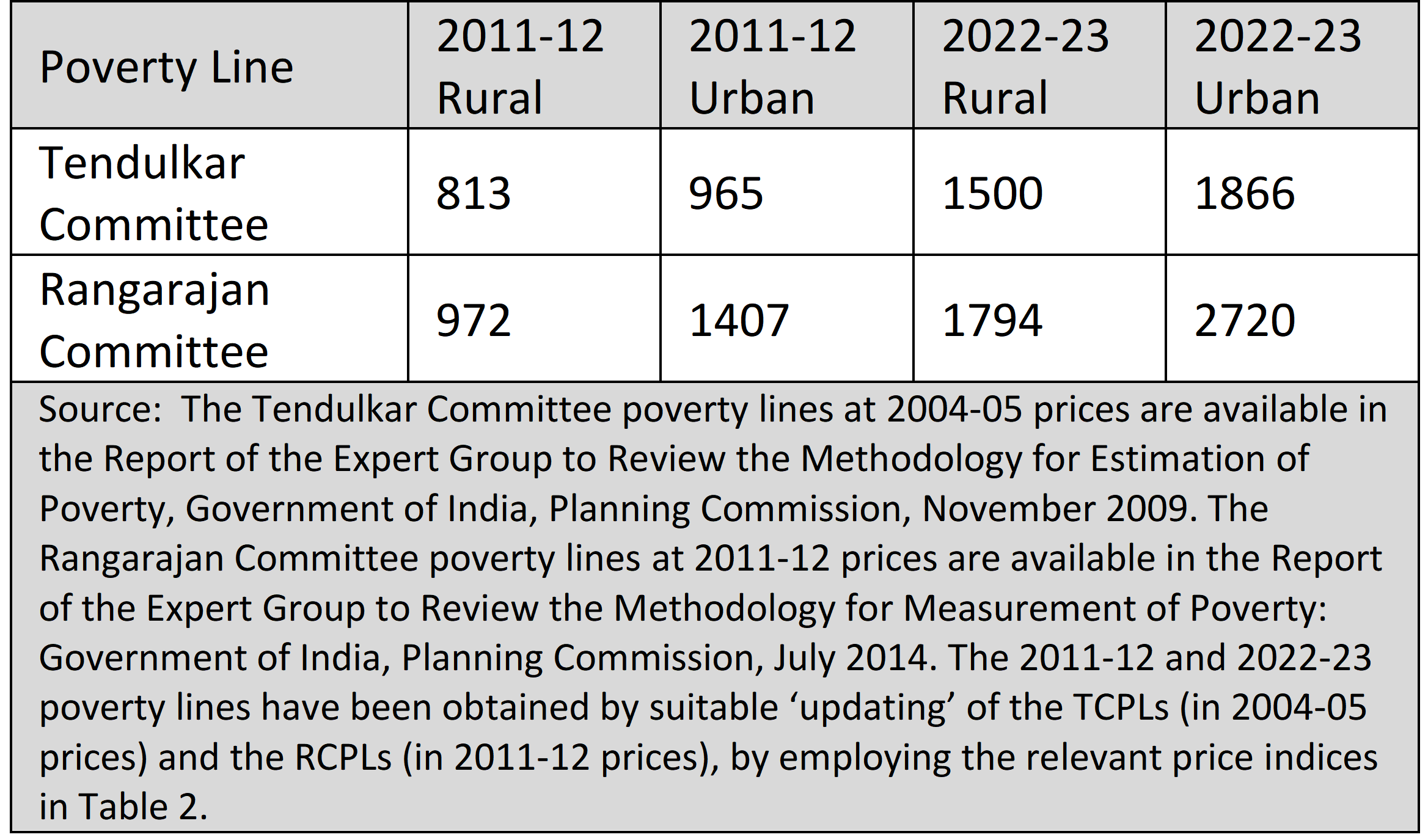
The employment of ‘low’ poverty lines has been an old problem. Over time, the poverty lines suggested by various Expert Groups set up by the Planning Commission have increased in real (or constant-price) terms: the Rangarajan Committee Poverty Line (RCPL) advanced in 2014 was higher than the Tendulkar Committee Poverty Line (TCPL) announced in 2009, which was itself higher than the Lakdawala Committee Poverty Line of 1993. The fact that each successive Committee proposed a higher line than that of its predecessor does not imply that even the most ‘generous’ of these lines satisfies some requirement of ‘adequacy’, seen as guaranteeing some minimally acceptable standard of living relating to the basic necessities of food, shelter, housing, clothing, and access to energy for cooking and lighting.
It is not clear what the ‘official’ poverty line is. In an occasional paper put out by the NITI Aayog in 2016 10‘Eliminating Poverty: Creating Jobs and Strengthening Social Programs,’ Occasional Paper No. 2, NITI Aayog, Government of India, March 2016. https://www.niti.gov.in/sites/default/files/2018-12/OccasionalPaper_No2_Poverty.pdf considerable space is devoted to a discussion of the relative merits of the Tendulkar and Rangarajan Committee poverty lines, the choice having been effectively whittled down to one between these respective lines. No final definitive recommendation is on offer, despite much agonising on the pros and cons of the two poverty lines. However, the inclination seems to be in favour of the TCPL, on the ground that the main objective of employing a poverty line should be that of tracking progress in addressing ‘extreme’ poverty, rather than that of identifying beneficiaries of transfers in anti-poverty programmes. On the other hand, some remarks attributed in The Hindu 11See fn 10. to a recent statement by the CEO of NITI Aayog perhaps suggest reliance on the poverty line proposed by the Rangarajan Committee: “We have had four, five different informal estimates for poverty in the absence of the 2017-18 survey findings. If we go by Rs.32 a day [the rural RCPL], which was the last accepted poverty line as of 2011-12, and factor in inflation trends since then to double that level to about Rs.60 a day, then you will see that poverty is less than 10%....”
For specificity, let us employ both the TCPL and the RCPL. The Report 12Report of the Expert Group to Review the Methodology for Estimation of Poverty, Government of India, Planning Commission, November 2009. of the Tendulkar Expert Committee suggests monthly per capita poverty lines of Rs.447 and Rs.538 for the rural and urban areas respectively at 2004-05 prices, The Report 13Report of the Expert Group to Review the Methodology for Measurement of Poverty: Government of India, Planning Commission. July 2014. of the Rangarajan Expert Committee suggests monthly per capita poverty lines of Rs.972 and Rs.1407 for the rural and urban areas respectively at 2011-12 prices. Employing the price indices in Table 2, we can present both the Tendulkar and Rangarajan Committee rural and urban poverty lines for 2011-12 and 2022-23 at current prices as in Table 7.
Table 7: The Tendulkar and Rangarajan Committee Rural and Urban Poverty Lines at Current Prices (Rupees Per Person Per Month): 2011-12 & 2022-23
Using the RCPLs and the 2011-12 and 2022-23 surveys’ distributional data, we can compute the relevant headcount ratios of poverty, which are reported in Table 8.
Table 8: Headcount Poverty Ratios (%) Using the Tendulkar and Rangarajan Committee Poverty Lines: 2011-12 & 2022-23
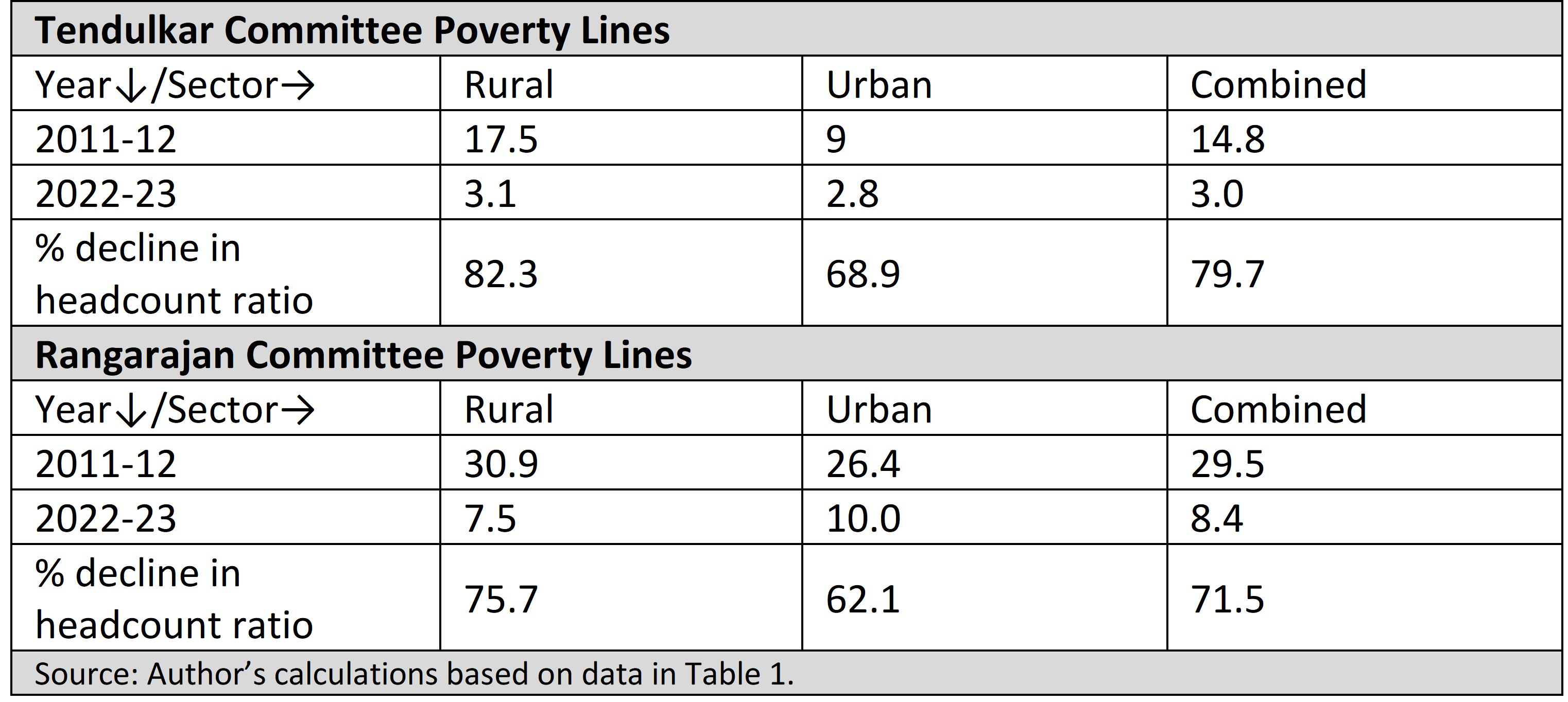
Quite in line with prior expectation, Table 8 reveals, under the Tendulkar Committee poverty lines 14It should be noted that the headcount ratios for the Tendulkar Committee poverty lines in 2011-12, as reported in this essay, are lower than the officially reported headcount ratios: this is because the official estimates have been calculated from the Mixed Reference Period (MRP) distributions, while the estimates in this article have been calculated, for consistency, from the Modified Mixed Reference Period (MMRP) distributions, and the MRP average per capita consumption levels are lower than their MMRP counterparts. This is reflected in the magnitudes of the headcount ratios. , a spectacularly impressive 80 per cent decline in the aggregate headcount ratio for India from nearly 15 per cent in 2011-12 to just 3 per cent in 2022-23. This should support the pleasant fancy of a virtual elimination (or abolition?) of ‘extreme’ poverty in the country. The achievement is quite something, post demonetisation, GST and covid. Less spectacular, but impressive all the same, is performance under the Rangarajan Committee poverty lines: a steep 72 per cent decline in the proportion of people in poverty in India, from around 30 per cent in 2011-12 to under 9 per cent in 2022-23. What however bears remarking is the oddity that with the RCPLs, we have a reversal of a decades-long trend, with the rural headcount ratio turning out to be lower than the urban ratio in 2022-23. It couldn’t be the data, could it?
A poverty ratio of less than 10 per cent is no doubt a good advertisement for the success of economic policy, but it is useful to remind oneself that these poverty numbers depend crucially on the parameters of the distribution used to generate them, as well as the poverty line employed. One supposes one is stuck with the distributions implied by the 2022-23 Survey data (however these may have been generated), but surely there is some leeway available in the matter of specifying a more, rather than less, reasonable poverty line. It is heartening to note that such a concession to both science and humanity is available in the rural and urban national minimum wage levels specified by an Expert Committee 15Report of the Expert Committee on Determining the Methodology for Fixing the National Minimum Wage: Ministry of Labour and Employment, Government of India, January 2019. appointed by the Government to investigate the issue. The reasonable notion that these normative wage levels could be interpreted as poverty lines has been suggested by researchers at the Azim Premji University (APU) 16Azim Premji University (2021): State of Working India 2021: One year of Covid-19, Centre for Sustainable Employment, Azim Premji University. Available at: https://cse.azimpremjiuniversity.edu.in/wp-content/uploads/2021/05/State_of_Working_India_2021-One_year_of_Covid-19.pdf .
Without suggesting that the approach advanced by the National Minimum Wage (NMW) Expert Committee is perfect, that approach is nevertheless a move in the right direction of assessing requirement on the basis of some notion of adequacy. Specifically, the Expert Committee has sought to arrive at a minimum wage by estimating both food and non-food requirements. In the first instance, it has taken account of age-sex-occupation variations across households in order to arrive at an adult equivalence scale, in terms of which an average household with 4.43 persons in 2011-12 has been converted into an equivalent household with 3.6 ‘consumer units’. Food-related needs have been arrived at by costing a ‘palatable’ diet that would address certain presumed norms of calorie, protein and fat requirements. Non-food needs have been assessed in terms of both ‘essential items’ (clothing, fuel and light, house rent, education, medical expenses, footwear, and transport) and ‘other items’ (recreation, festivals/ceremonies, and provision for marriage expenditure): requirements here have been estimated (possibly questionably) on the basis of observed 2011-12 expenditure levels on these items for distinguished fractiles of the population.
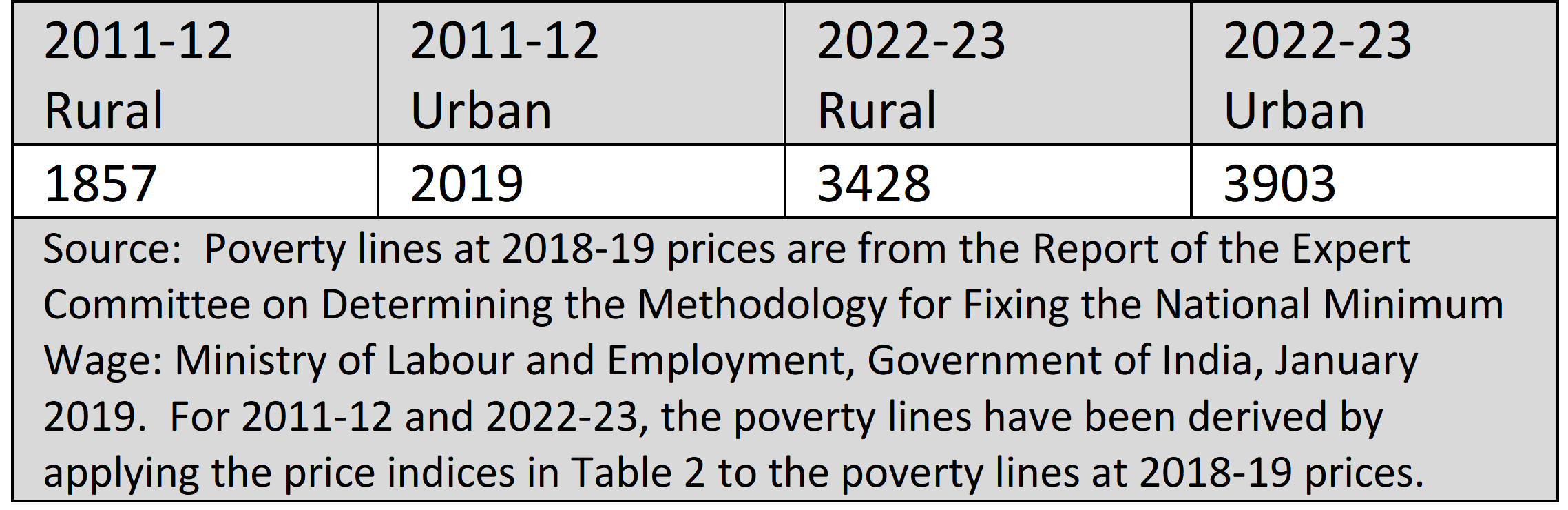
For a ‘typical’ household with 3.6 consumer units, the daily food and non-food requirements have been costed at Rs.375 for the rural areas and Rs.430 for the urban areas, at 2018-19 prices: these work out, assuming 26 working days to a month, to monthly requirements of Rs.9750 (rural) and Rs.11,180 (urban). For a working person to be able to support a household with 3.6 consumer units, the monthly per consumer unit requirement would then be Rs.2708 (= 9750/3.6) in the rural areas, and Rs.3106 (= 11,180/3.6) in the urban areas, at 2018-19 prices. Taking Rs.2708 per person per month at 2018-19 prices as the rural poverty line, and Rs.3106 per person per month as the urban poverty line, the price indices available in Table 2 can be employed to obtain the rural and urban poverty lines at 2011-12 and 2022-23 prices: these will be called the National Minimum Wage poverty lines (or NMWPLs for short), and are presented in Table 9. Tables 7 and 9 reveal, in a comparison of the Minimum Wage and Rangarajan Committee poverty lines, that the rural NMWPL is about 1.9 times the rural RCPL, while the urban NMWPL is about 1.4 times the urban RCPL. No doubt this will elicit horrified gasps from those that would set their faces against wild extravagance on behalf of the poor, but let us pause for a moment to ask what is really involved: from a simple, common-sense point of view which is informed by some practical knowledge of prices, incomes and living standards in the country, are contemporary monthly allowances for an average family of between Rs.12,000 and Rs.14,000 anywhere near extravagant?
Table 9: The National Minimum Wage Rural and Urban Poverty Lines at Current Prices (Rupees Per Person Per Month): 2011-12 & 2022-23
Using the NMWPLs and the 2011-12 and 2022-23 surveys’ distributional data, we can compute the relevant headcount ratios of poverty, which are reported in Table 8.
Table 10: Headcount Poverty Ratios (%) Using the National Minimum Wage Poverty Lines: 2011-12 & 2022-23
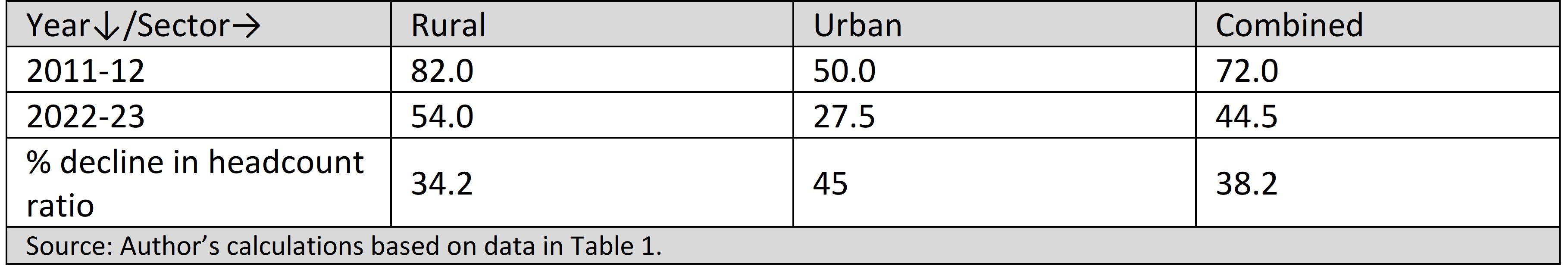
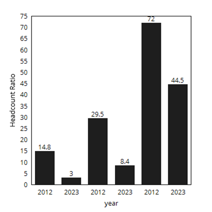
With a more reasonable poverty line such as is yielded by the national minimum wage specification, both magnitudes and trends are vastly less flattering than those yielded by the RCPLs. With the NMWPLs, at the all-India level, poverty is seen to decline by 38 per cent, from 72 per cent in 2011-12 to nearly 45 per cent in 2022-23. In contrast, under the Rangarajan Committee and Tendulkar Committee poverty lines, we have massive declines of between 72 per cent and 80 per cent in the headcount ratio from relatively much lower levels, of between around 30 per cent and 15 per cent respectively in 2011-12. The 2022-23 data, taken at face value, suggest that ‘extreme’ poverty is down to 3 per cent, and somewhat less extreme poverty down to less than 9 per cent; but even these data cannot deny a nearly 45 per cent incidence of presumably ‘normal’ poverty. Figure 8 provides a visual picture of these magnitudes and trends of the headcount ratio at the all-India level, under alternative poverty lines.
Figure 8: The Headcount Ratios of Poverty (All-India) in 2011-12 & 2022-23, under the Tendulkar Committee, the Rangarajan Committee, and the National Minimum Wage Poverty Lines
Summary and Concluding Discussion
Taking the 2022-23 HCES data at face value, and assuming comparability with the NSO 2011-12 survey data, an analysis of these surveys suggests the following: both rural and urban per capita average consumption levels have increased significantly, with the cumulative distribution functions for 2022-23 first-order stochastically dominating the 2011-12 distributions; there has been a most impressive improvement in the quintile income statistic; Sen’s welfare index has benefited from both an increase in average consumption and a diminution in the Gini coefficient of inequality; inequality has declined in terms of the top-10-to-bottom-10 ratio, in terms of Lorenz dominance, in terms of the Gini coefficient (which has registered a particularly sharp decline in the urban areas), and in terms of large rates of growth of the poorer income groups and profoundly modest growth for the richest decile of the population. Employing the Rangarajan Committee rural and urban poverty lines, one finds a huge proportionate decline in the poverty headcount ratio to a level of just around 8.5 per cent at the all-India level (and in fact down to 3 per cent employing the more modest Tendulkar poverty lines); and—despite all these pleasing outcomes—when one employs a more reasonable poverty line such as is yielded by the national minimum wage, more than two-fifths of the population is seen to be in poverty in 2022-23 (which is nevertheless an improvement in relation to the 72 per cent headcount ratio in 2011-12).
Are any of the major findings listed above plausible? It is instructive to view them in the light of the following considerations.
One, towards the end of 2016, an event called demonetisation occurred. Despite the breezy view put out by some economists that any adverse effects of demonetisation on the economy were at worst a temporary blip on the landscape, it is hard to imagine that there was no seriously negative long-term impact, especially on the poor and labouring classes, of an abrupt overnight withdrawal of 86 per cent of the national currency.
Two, in mid-2017, the Goods and Services Tax (GST) was implemented. As argued by Arun Kumar 17Arun Kumar (2023): ‘A Taxing Tale: Assessing the Impact of Six Years of GST,’ The Leaflet Bulletin, July 1, 2023. https://theleaflet.in/a-taxing-tale-assessing-the-impact-of-six-years-of-gst/ , the non-availability of input tax credit to those exempt from GST, mainly small agents in the unorganised sector, resulted in a shift in demand for certain goods from the unorganised to the organised sector: a decline in the fortunes of the unorganized sector is scarcely a likely indicator of rising consumption levels among the poor.
Three, 2020 and 2021 witnessed two waves of the Covid-19 pandemic. Lockdown, loss of livelihood, loss of earnings, massive urban-to-rural migration, catastrophic health expenditures—all of these have been reported. The first wave alone of the pandemic may have caused an additional 75 million (Pew Research Centre 18Kochhar, R. (2021): ‘In the pandemic, India’s middle class shrinks and poverty spreads while China sees smaller changes’, Pew Research Centre , March 18. https://www.pewresearch.org/fact-tank/2021/03/18/in-the-pandemic-indias-middle-class-shrinks-and-poverty-spreads-while-china-sees-smaller-changes/ ) to 230 million (Azim Premji University 19See fn 13. ) persons to slip into poverty in 2020. It is hard to imagine the sort of bounce-back from such adversity that would have been needed to explain the pleasing findings from the HCES 2022-23. The notion that the post-pandemic recovery in growth has been K-shaped (signifying that the organized sector and relatively better-off segments of the population have been on an upward trajectory while the unorganized sector and relatively worse-off sections have been on a downward trajectory) is naturally unpopular with the Establishment, but the case for this has been argued seriously by, among others, D. Narayana 20Narayana, D. (2022): ‘Is India Experiencing a K-Shaped Recovery?,’ The India Forum, January 06, 2022. https://www.theindiaforum.in/article/india-experiencing-k-shaped-recovery , V. Sridhar 21Sridhar, V. (2022): ‘The Mirage of an Economic Recovery,’ Newsclick, 01 June, 2022. https://www.newsclick.in/The-Mirage-Economic-Recovery , and Ajit Ranade 22Ranade, A. (2022): ‘The Politics and Economics of India’s K-Shaped Recovery,’ The Times of India, December 12, 2021. https://timesofindia.indiatimes.com/india/the-politics-and-economics-of-indias-k-shaped-recovery/articleshow/88240086.cms .
Four, low levels of ‘extreme’ poverty should surely be incompatible with hunger. The Global Hunger Index (GHI) is an indicator of nutritional status calculated across countries on an annual basis by the agency Concern Worldwide and Welthungerhilfe. The GHI is an aggregate of four distinguished headcount ratios: the proportion of the population with inadequate calorie intake (under-nourishment), the proportion of the under-5 population with low height-for-age (child stunting), the proportion of the under-5 population with low weight-for-height (child wasting), and the proportion of children who die below the age of five (child mortality). A GHI score in the range of 20-34.9 is regarded as ‘serious’. In 2023, India was in the ‘serious’ category, with a score of 28.7, and ranked 111th in a list of 125 countries 23Global Hunger Index India. https://www.globalhungerindex.org/india.html .
Five, it is useful to look at data on employment and unemployment, a principal source of information on which is the NSO’s annual publication, the Periodic Labour Force Survey. The (usual status) unemployment rate has shown a steady decline from 6.1 per cent in 2017-18 to 3.1 per cent in 2022-23. What this decline conceals, however, is that the unemployment rate in 2017-18 was of an unprecedentedly high order; and that the unemployment rate of 3.1 per cent in 2022-23 exceeds that in 2011-12, when it was 2.1 per cent. Also encouraging, on the face of it, is the increasing trend of the Labour Force Participation Rate (LFPR) from 2017-18 to 2022-23. However, this apparent improvement is compromised by the large additions to the labour force of women, unpaid helpers in family enterprises, and the aged (60-plus) population (Ishant Anand and Anjana Thampi 24Anand, I. and A. Thampi (2021): ‘Growing Distress and a Falling Unemployment Rate,’ The India Forum, September 17, 2021: https://www.theindiaforum.in/article/rising-distress-and-falling-unemployment-rate-what-going?utm_source=website&utm_medium=organic&utm_campaign=category&utm_content=Economy ). Real wages, to put it minimally, have shown no substantially increasing trend (Mehrotra and Kumar 25See fn 3. ).
Maitreesh Ghatak, Mrinalini Jha and Jitendra Singh 26Ghatak, M., M. Jha and J. Singh (2024): ‘Quantity vs Quality: Long-term Trends in Job Creation in the Indian Labour Market,’ The India Forum, January 31, 2024. draw attention to not only the quantity but also the quality of jobs created, in terms of the composition and earnings of the employed. Their findings in this regard are not encouraging. Among those employed, the most secure jobs are those held by the salaried class followed by those in casual labour, while the most precarious jobs are those held by the self-employed category. The authors just mentioned find that from 2017-18 to 2021-22, the share of the salaried and casual labour categories among the employed has fallen while that of the self-employed category has risen. In the last category, the share of the most precariously-placed sub-category—that of unpaid family workers—has risen. Focusing attention on the self-employed category, it is found that over 2017-18 to 2021-22, there has been a fall in the average real earnings of the richest quintile; and, at a more granular level, for own-account workers among the self-employed, there has been a fall in the average real earnings of the bottom quintile. Further, recent years have seen a large increase in the issue of job-cards under the MGNREGA programme; as also a large increase in the younger (18-30) population seeking employment, with the supply of jobs falling far short of their demand (Ankur Bhardwaj and Ashwini Deshpande 27Bhardwaj, A and A. Deshpande (2021): ‘High Demand for MGNREGA is a Ringing Fire Alarm,’ The Wire.in, September 17, 2021: https://www.deccanherald.com/opinion/food-security-for-all-time-to-think-long-term-1149608.html ). It is hard to correlate dramatic declines in poverty with these labour market features of the economy.
Six, how—with the best will in the world—does one account for the picture of declining inequality and inclusive growth suggested by the 2022-23 Survey? Consumption depends not only on income but also on wealth. It is hard to see how consumption inequality declines in the face of increases in income and wealth inequality. As for the latter, in a very recent study, Nitin Bharti, Lucas Chancel, Thomas Piketty and Anmol Somanchi 28Bharti, N., L. Chancel, T. Piketty and A. Somanchi (2024): Income and Wealth Inequality in India, 1922-2023: The Rise of the Billionaire Raj, Working Paper No. 2024/09: World Inequality Lab, March 2024. https://wid.world/wp-content/uploads/2024/03/WorldInequalityLab_WP2024_09_Income-and-Wealth-Inequality-in-India-1922-2023_Final.pdf say:
We combine national income accounts, wealth aggregates, tax tabulations, rich lists, and surveys on income, consumption, and wealth in a consistent framework to present long run homogeneous series of income and wealth inequality in India. Our estimates suggest that inequality declined post-independence till the early 1980s, after which it began rising and has skyrocketed since the early 2000s. Trends of top income and wealth shares track each other over the entire period of our study. Between 2014-15 and 2022-23, the rise of top-end inequality has been particularly pronounced in terms of wealth concentration. By 2022-23, top 1% income and wealth shares (22.6% and 40.1%) are at their highest historical levels and India’s top 1% income share is among the very highest in the world.
In what is already turning out to be a very long article, further comment should be superfluous.
Should one then attribute the welfare, inequality and poverty outcomes suggested by the 2022-23 Survey to the Government’s welfare schemes? To the Pradhan Mantri Garib Kalyan Anna Yojana (PMGKAY), whereby ration card holders are entitled to 5 kilograms of free food grain per month (apart from the 5 kilograms of subsidized food grain already offered through the Public Distribution System)? Or to the scheme for providing LPG cylinders to below-poverty-line beneficiaries under the auspices of the Pradhan Mantri Ujjwala Yojana (PMUY) Scheme? Without seeking to minimize the impact of these interventions, it is worth noting that the PMGKAY was introduced at the time of the Covid crisis, and while it may have helped to prevent the bottom from caving in completely, it could hardly signal an over-correcting bounce-back. Additionally—and as pointed out by Dipa Sinha 29Sinha, D: ‘Food Security for All: Time to Think Long-Term,’ Deccan Herald, 30 September, 2022. https://www.deccanherald.com/opinion/food-security-for-all-time-to-think-long-term-1149608.html , among others—the coverage of the scheme, at 67 per cent of the population, may have missed out on a hundred million eligible ration card holders because of reliance on the 2011 population figure in the absence of a fresh Census. As for LPG cylinders, it is one thing to have one, but another to be able to afford refills. Finally, it is interesting to note from the 2022-23 Survey data that there is very little difference between the per capita average consumption of the distribution in which the cost of goods and services received free from welfare schemes is imputed, and that of the distribution (the one reported in this article) without such imputation: it turns out that the proportionate difference between the two averages is just 2.31 per cent for the rural areas, and even less, at 0.96 per cent, for the urban areas.
Taking everything into account, it would appear that either the 2022-23 Consumption Survey is radically non-comparable with its predecessor NSO surveys, or there is real reason to doubt the reliability of the Survey. No doubt, though, that what the data have to say will prevail in favour of the 2022-23 Survey, just as what the data had to say prevailed against the impugned 2017-18 Survey. But then, perhaps, the fault resides with us, in the folly of “our monstrous worship of facts”. Perhaps the 2022-23 NSO Survey is simply a commendable vindication of Oscar Wilde’s sentiments on life and representation. Perhaps it is, in the end, just an effort to preserve Art and Beauty while banishing Poverty and Ugliness forever from the land.
The author would like to acknowledge, without implicating, Rammanohar Reddy, Maitreesh Ghatak and Rishabh Kumar for helpful comments on an earlier version of this article.
This is the first in a symposium of articles that will analyse the Household Consumption Expenditure Survey of 2022-23. The next one will be published on 12 April.