


What has been the record of the labour market in India since the early 1990s in terms of job creation? Are the trends uniform or are there clear structural breaks in terms of employment generation over the last three decades? Further, are the aspirations of the working masses limited to finding jobs or should we also be concerned about the quality of jobs that are getting created in the economy?
The recent rise in employment levels and fall in unemployment will be indicative of a positive trend in the labour market if there are 'good' jobs getting created in the economy. Else, it can end up resulting in celebration of a rising distress in the masses.
We examine trends in aggregate measures relating to the labour market that give a more quantitative picture, and inspect in more granular detail trends in the 'quality' aspect of jobs created in the economy by looking both at the composition of employment by type (salaried, casual, self-employed) and the distribution of earnings over the last three decades.
Both the labour force participation rate (LFPR) and unemployment rate (UR) reflect a combination of whether an individual is looking for a job and actually able to get one. The UR is defined as the percentage of unemployed individuals in the labour force as a share of the employed and the unemployed – the term unemployed itself referring to those who are willing and/or able to work but have not been able to find work. The LFPR, in turn, is the percentage of the employed and the unemployed as a share of the working age population in the labour force.
A major misconception about the labour market is that a low UR is unambiguously a positive indicator of the health of the labour market. The reason is that a fall in unemployment does not necessarily imply a rise in employment. Both can move in the same direction because of the presence of a third category, the out of labour force (OLF). In other words, the total working age population of the economy is divided into three, not two, categories. The OLF consists of individuals who are either not willing to or not looking for work. If there is a rise in the share of the OLF because individuals get discouraged by job prospects and stop looking for jobs, it can still lead to a fall in UR without the creation of any new jobs. The unemployment measure in itself thus is not a fair indicator of the health of the labour market.
The aggregate employment and unemployment metrics give a count of the number of jobs, but say very little about the ‘quality’ of jobs in the economy.
More importantly, even if the fall in unemployment is due to an actual rise in employment and not the OLF, the rise in the broad category of employment itself need not be a sufficient cause for cheer. It would indeed be a positive development if it is being driven by an increase in high-wage jobs, including salaried ones, or people setting up flourishing businesses and generating employment. On the contrary, it may be driven by a rise in forms of employment that are not particularly remunerative, such as some form of low-return informal sector self-employment activity just to eke out a living or as a helper in household enterprises, a subcategory of the self-employed because they cannot find anything better to do. 1The subcategories of the employed, as well as the main categories (employed, unemployed, and out of labour force) are explained in detail in the Appendix.
This points to the fact that the aggregate employment and unemployment metrics give a count of the number of jobs, but say very little about the quality of jobs in the economy. We focus on two metrics of 'quality' to evaluate the health of the labour market. We carefully scrutinise the composition of employment by type (salaried, casual, employer, own-account worker, or unpaid family worker), as well as the distribution of earnings by type of employment along with their dispersion over the last three decades.
There exists a large literature documenting how the Indian labour market has fared in terms of employment creation as well as earnings, as well as the trends and patterns of various categories of workers (gender, caste). 2For example, 'The State of Working India - Social Identities and Labour Market Outcomes' (2023) provides an excellent and comprehensive overview of the state of the Labour Market. Our goal is to delve deeper in two dimensions: first, to assess the quantity vs quality of job creation aspect; and, second, to identify distinct phases in terms of the trends in the number of jobs getting created versus the quality of such employment over the time-frame we focus on (from the early 1990s to the present).
We first summarise what the data tells us about the more aggregate measures relating to the labour market in the last three decades. Following, we look at the time trend in the composition of the workforce in terms of categories of the employed. Then, we look at data on earnings by types of employment over these three decades, before concluding the analysis.
Aggregate picture of the labour market
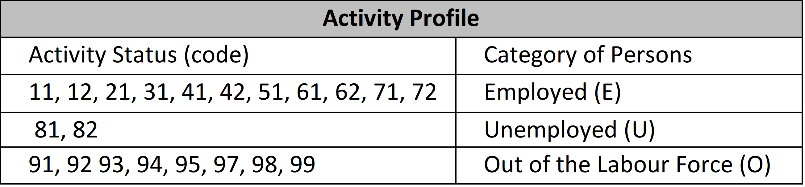
For aggregate trends, we need to consider three categories of individuals in the working age population as far as their connection with the labour market is concerned: those who are employed (E), those who are unemployed (U), and the rest – the out of labour force (OLF), which we denote by O. Therefore, the total working age population (P) consists of these three categories, or,
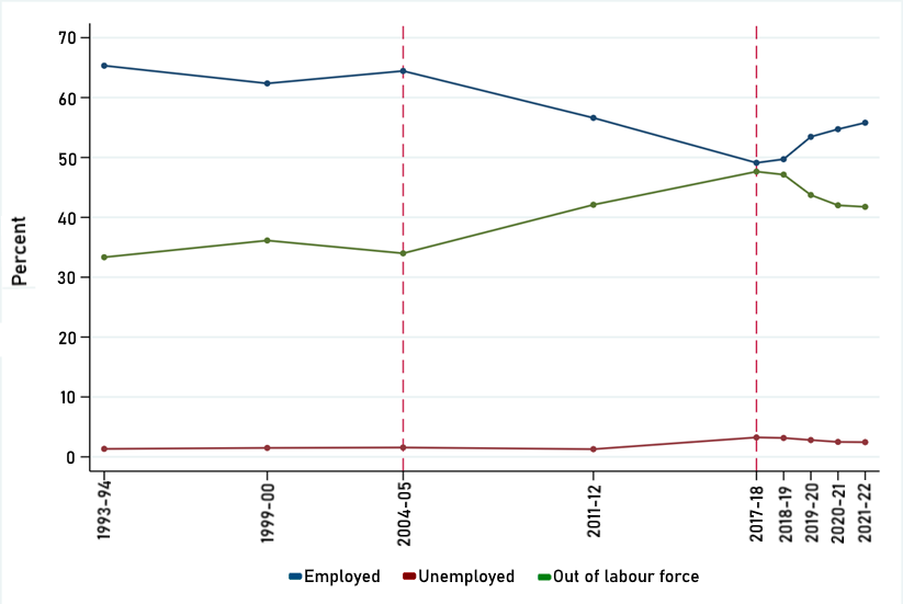
Figure 1 presents the absolute number of the employed and the size of the working age population. Figure 2 presents aggregate trends in the labour market in India in terms of the employed, unemployed, and the out of labour force as fractions of total working age population since the early 1990s up until the present.
We divide the period of our analysis (1993–2021) into three sub-periods on the basis of the observed change in employment patterns, that is, looking at the overall quantity aspect of jobs. Between 1993–94 and 2004–05, roughly a decade, the rise in employment largely kept pace with the increase in population. This resulted in a roughly constant LFPR of around 65% over this period. 3We use usual status (ps+ss) approach to estimate the LFPR which includes “(a) the persons who either worked or were seeking/available for work for a relatively long part of the 365 days preceding the date of survey and also (b) those persons from among the remaining population who had worked at least for 30 days during the reference period of 365 days preceding the date of survey.” We will call this the first phase.
We can see from Figure 1 that from 2004–05 to 2017–18 there was a marked slowdown in this trend. There was a stagnation in the absolute employment numbers even as the working-age population continued to grow. Consequently, there was a drop in the LFPR, as we can see from Figure 2. It fell to 52% in 2017–18 from 66% in 2004–05 . We will call this the second phase. 4In 2017-18 the EUS was replaced by PLFS to measure the employment situation in India. The questions and categories stay intact in both the surveys. Jajoria and Jatav (2020) offer details on the comparability between NSS-EUS and PLFS. It is also to be noted that EUS and PLFS provide the official employment numbers collected and released by the government, and are the most reliable sources of employment indicators available to analyse the change in employment situations over this period.
The period spanning 2017–18 to 2021–22 is the third phase where there was a reversal of the previous trend, with the LFPR increasing to 58% in 2021–22 from 52% in 2017–18. The period thus saw a faster rise in the absolute employment levels than the rise in the working-age population.
We can also see from Figure 1 that the WPR evolves over these three phases, mirroring what is going on with the LFPR. The unemployed population as a fraction of the total working-age population (U/P) remained fairly constant below 2% from 1993–94 to 2011–12. While it went up to 3% in 2017-18, from that point on it has stayed at a similar level, though with a very marginal decline recently.
Figure 1: Population vs Employment growth (1993-94 to 2021-22)
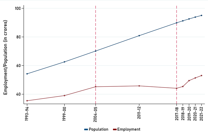
Figure 2: Labour Force Status (as percentage of working age population)
We have chosen the three phases based on the observed trends in employment creation. Purely in terms of quantity – the number of jobs – it would appear that Phase 3 looks the most positive, followed by Phase 1. Phase 2 appears the most sluggish in terms of total employment.
The question is, do these patterns hold in terms of the quality of these jobs as well? Before we turn to examine these quality dimensions, a few observations about the unemployment rate are in order.
It is important to note that the share of unemployment depicted in Figure 2 is not the unemployment rate. We are simply reporting the number of unemployed as a proportion of the total working age population. The unemployment rate (UR) in contrast tells us how many individuals are unemployed but actively looking for work as a share of the total of employed and unemployed but looking for work, that is, UR = U/(E+U). In simple terms this means that those who belong to the working age population but are out of the labour force (students, home makers, etc.) do not appear in the unemployment rate. They do however get reflected in the above reported numbers (Figure 2) because they form a part of the working age population.
To note this difference, we report the UR for different age categories in Figure 3 below. Considering all working age group, we see: a fairly flat figure of around 2% from 1993–94 to 2004–05 (the first phase), a spike to 6.4% in 2017–18 (the latter part of the second phase), followed by a decline in the UR since 2017–18 although it still remains at an all-time high level of 4% as compared with the first phase.
Figure 3: Unemployment rate (unemployed as % of working and those looking for work)
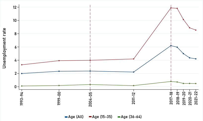
This trend gets further accentuated for unemployment amongst the youth (age group 15–35). While hovering between 4% in the first phase, it skyrocketed in the second phase to 12% in 2017–18, and after that it shows a downward trend, but remains at an all-time high level of 9%. Also, notable from the figure is the fact that UR is close to zero for the age-group 36-64, and the fact that we still have a non-negligible overall UR reflects the burden of the demographic bulge in the youth population.
Trends in composition of employment
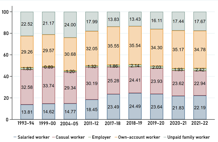
We first examine the composition of employment – casual, salaried, and self-employed – and then at the composition of the three subcategories of the self-employed: employer, own-account worker, and unpaid family worker.
Figure 4 shows the share of the different employment categories within the employed population over the time period 1993–94 to 2021–22.
Figure 4: Types of Employment (percentage distribution among employed)
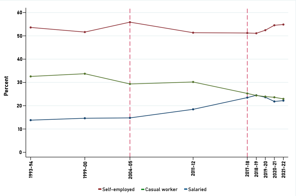
The first phase (1993–94 to 2004–05) saw a rise in the proportion of the salaried and self-employed with a fall in the proportion of casual workers. Between 2004–05 and 2017–18, the trend of rising proportion of salaried workers continued and went up to 23.5% in 2017–18 from 18.5% in 2004–05, a rise of 5 percentage points. Alongside, there was a drop in the proportion of both casual workers and the self-employed. This trend reversed in the third phase, with only the self-employment category remaining on the rise. The proportion of the self-employed rose consistently to 55% in 2021-22 from 51% in 2017-18. The proportion of both salaried and casual workers fell in this period.
To understand this in terms of the quality of employment, it is critical to note that the self-employment and casual work category in India is understood as precarious forms of employment with poor job security and significantly lower average earnings 5We examine the average earnings of different categories of the employed in the next section. as compared with the salaried class. In contrast, salaried work – even though a heterogeneous category in itself – is unambiguously understood as the most desirable category of work.
This suggests that even though in terms of quantity Phase 3 seems to be outperforming all other phases, the employment outcomes in this phase in terms of quality appear to be the worst of the three phases, with a fall in the proportion of the most secure jobs and a rise in the proportion of the more precarious kinds of jobs. We substantiate this further by looking at the kinds of self-employment which are seeing a rise in the third phase.
It is critical to note that the self-employment and casual work category in India is understood as precarious forms of employment with poor job security and significantly lower average earnings.
Turning now to the subcategories of the self-employed (Figure 5), NSS-EUS and PLFS record three different kinds of self-employment: employer, own-account workers 6An example of an own-account worker could be a corner-shop owner, a person setting up a temporary food cart, a person setting a stall in a weekly vegetable market, etc. All these enterprises are typically of small scale which do not hire any paid workers. , and unpaid family workers. 7These categories are described in greater detail in the Appendix. The three subcategories of self-employment can be ranked cleanly in terms of the quality they indicate. A rise in the proportion of the category of employers will be indicative of improving quality. This is followed by the category of own-account workers, and, lastly, by unpaid family helpers. The share of employers has consistently remained below 5% between 1993 and 2021.
The first phase did not see any major reshuffling in the subcategories of self-employment (Figure 5). The second phase saw an unambiguous improvement in quality as seen in a consistent and significant drop of 17 percentage points in the share of unpaid family workers (26% in 2017–18 from 43% in 2004–05) and a rise in the proportion of employers and own-account workers. In sharp contrast, the quality in the third phase took a downward turn. The share of unpaid family workers went up to 31% in 2021–22: a 5 percentage point increase in 5 years.
Figure 5: Types of Self-Employment (percentage distribution among categories)
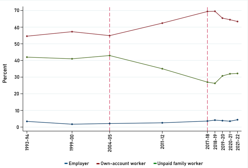
Figure 6 has the trends in all categories of the employed, with these figures presenting, respectively,
Figure 6: Overall Pattern of Employment Categories (percentage distribution)
It should be noted that the patterns captured in Figure 6 do not imply that workers moving from one category to another is what causes a change in their relative proportions. From Figure 1 we know that there has been a rise in total employment levels. If we combine these two figures, the picture that emerges is that additional individuals are joining the pool of the employed as unpaid family workers in Phase 3, which is leading to a rise in the share of employment in unpaid family workers and a decline in all the rest of the categories covered under the WPR.
Together, the results of the analysis here are indicative of a deteriorating quality of employment vis-a-vis the nature of these jobs after 2017–18 (the third phase). While we do not present the figures for subcategories of workers, it is worth mentioning that the overall trend in terms of the dominance of the category of unpaid family members are accentuated as we zoom into subcategories of workers such as the youth (15–35 years), and the college-educated youth, respectively.
The heterogeneous, yet 'good' category of regular wage/salaried employment was rising in the first two phases, more starkly in the second phase. Alongside, there was a drop in the more precarious job categories: casual and self-employment. We do not find this trend continuing in the third phase. Instead, there is a significant rise in the share of the self-employed in the economy. Amongst the three subgroups of self-employment, the share of the employers group stagnates at a low 2%, the own-account workers (who are the largest chunk within the self-employed) do not change much over the third period, while the share of unpaid family workers see the sharpest increase.
The rise in employment in the third phase is thus driven by unpaid family workers. From the quality aspect, this presents a matter of concern and points towards a possible rise in distress employment.
Trends in the distribution of earnings
Finally, we turn to the most relevant metric of quality as far as job creation in the labour market goes: earnings. One may argue that even though not enough 'good jobs' have been created in terms of job security, the jobs themself are well-paying and this gets reflected in higher real earnings from the existing jobs. We examine this aspect of job quality in this section while bearing in mind that the only significant increase in the fraction of employed in Phase 3 is coming from the cohort of unpaid family workers.
NSS-EUS reports earnings of two categories of workers: the regular wage/salaried, and the casual workers. Earnings for the self-employed workers were not collected in the survey, that is, till 2011-12. Earnings for all three kinds of workers became available starting in 2017–18 with the PLFS survey.
Figure 7 reports the average real daily wages for regular wage/salaried and casual workers between 1993–94 and 2021–22. All earnings are in 2010 prices. It should be noted that to make the numbers comparable across the NSS-EUS and the PLFS surveys, this does not include earnings for the self-employed for any year.
Figure 7: Average real earnings over time (in Rs/day, 2010 prices, excluding the self-employed)
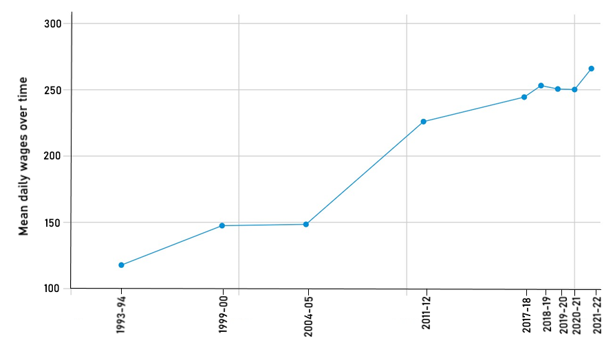
It is clear from Figure 7 that average real earnings have been going up in all three phases. As the economy grows, real earnings increase.
To understand the trends, we look at their rate of growth. The average annual rate of growth in earnings was markedly high in Phase 2 compared with both Phase 1 and 3. Juxtaposing this with findings from the previous section informs us that even though there was no significant increase in the total employment numbers in Phase 2, there was a rise in the proportion of salaried employment along with a high growth in the average real earnings. This is indicative of an improving job quality in Phase 2.
Next, we look at earnings for the different employment categories. Figure 8 reports the average real earnings over time separately for all three different kinds of workers for Phase 3, the period in which we have data for all categories of workers. Comparing Figures 7 and 8 immediately demonstrates that including the self-employed category pulls down the overall average earnings for all workers.
Figure 8: Average real earnings over time by employment type (in Rs/day, 2010 prices)
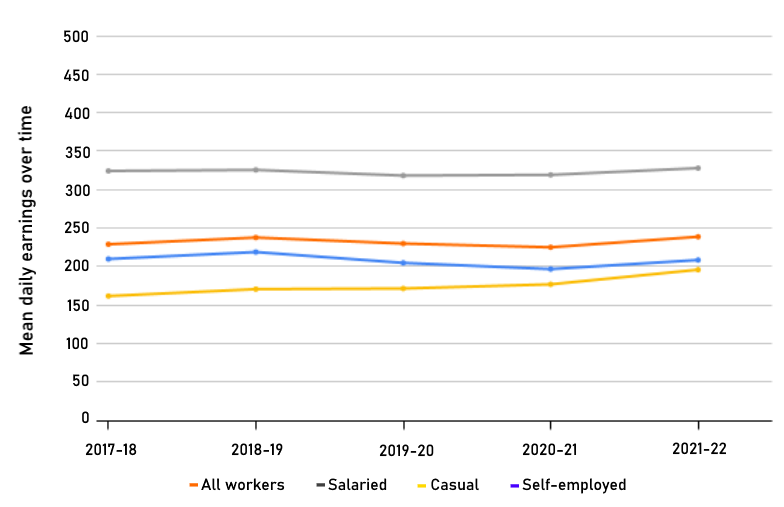
There are two things that are clear upon inspection.
First, the level of earnings shows a clear ranking with salaried workers’ earnings being much higher than that of the other two categories, which suggests that despite being a heterogeneous category, the salaried class belongs to the category of 'good' jobs. That the mean earnings of the self-employed are lower than that of the regular wage/salaried and closer to that of casual workers illustrates why a rise in employment fuelled from the self-employed category is not an indicator of creation of good jobs in the economy.
Second, average earnings have not been going up for all workers. It is only for the casual workers that we see a steady rise in average earnings over this period, as Figure 9 shows. Earnings for the regular wage/salaried group of workers as well as the self-employed have stagnated between 2017–18 and 2021–22.
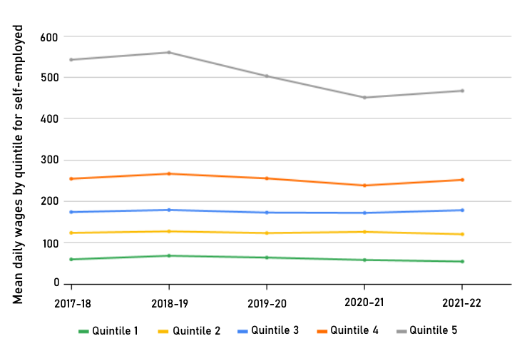
We turn to the distribution of earnings within each broad category of employment. For this, we create quintiles amongst the self-employed workers and track these dynamic quintiles 8We create quintiles for every year using the overall earnings of workers belonging to the respective employment types. over time. This tells us if the growth in earnings of the self-employed varies depending on which segment of the distribution one is looking at. Figure 9 shows that earnings for the self-employed in 2021–22 are no different from those in 2017–18, across all but the top quintile category. There is an actual drop in the average daily wages for the fifth quintile, the richest 20% of the self-employed workers.
Figure 9: Average real earnings of self-employed (in Rs/day, 2010 prices)
We further untangle this to look at the one specific kind of subcategory which forms the bulk of the self-employed: the own-account workers. Figure 10 plots the average quintile earnings exclusively for the own-account workers. Across the quintiles, there is stagnancy. Moreover, the average earnings for the poorest 20% of own-account workers actually fell by 20% over the five year period between 2017–18 and 2021–22.
Figure 10: Average real earnings of own account workers (self-employed) (in Rs/day, 2010 prices)
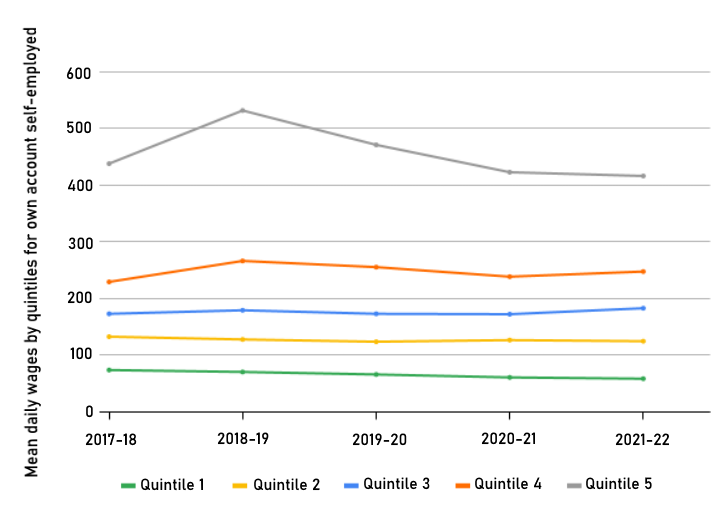
Figure 11 does a similar analysis for regular wage/salaried work, the most desirable jobs in the economy in terms of stability. We saw in Section 2 that such jobs have not seen any significant increase in Phase 3. Further, the existing jobs appear not to have seen an improvement in their conditions as well, as measured by earnings. As can be seen, earnings for the regular wage/salaried group of workers has stagnated in real terms between 2017–18 and 2021–22 across all quintile groups.
Figure 11: Average real earnings of regular wage/salaried workers (in Rs/day, 2010 prices)
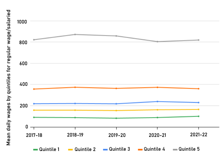
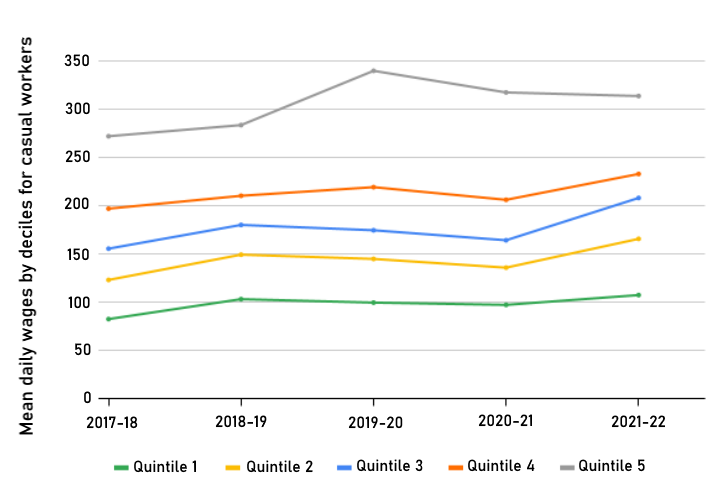
Figure 12 plots the earnings from casual work, the only category which saw an overall rise in average earnings over the study period, as shown in Figure 8. The increase in earnings for casual workers, though marginal, is seen across all quintiles.
Figure 12: Average real earnings of casual workers (in Rs/day, 2010 prices)
The numbers from this section thus indicate that the self-employed – the category that has seen the highest growth in Phase 3 – saw a stagnation in their real earnings. The 'good job' holders – the salaried class – have not seen any real increase in their earnings between 2017–18 and 2021–22. This is on top of there being an actual shrinkage in the proportion of such jobs over the period.
Conclusions
The story that emerges by looking at some of the key statistics relating to the labour market in India is: from 2017-18 onwards the LFPR has shown an increasing trend and the UR a declining trend. While this appears like a positive development, looking at the numbers more closely, we see signs that are indicative of a deteriorating quality of employment generation.
The main driver behind the trend in the aggregate indicators of the labour market is the rise in employment in the self-employed category, which, in turn, has been driven by a rise in unpaid family work subcategory. These tendencies look sharper if we zoom into the subcategories of the youth and the educated youth. Moreover, the self-employed, whose jobs are more precarious in nature and have significantly lower earnings, compared with the categories that can be described as 'good jobs', have seen the highest increase in the number of jobs since 2017–18 without any increase in real earnings.
In contrast, those holding the 'good jobs' – the regular wage and salary earners – have seen a decline in the share of total employment in the economy between 2017–18 and 2021–22. There has also not been any real increase in their earnings.
The cause for concern is not only whether the young in the most populous country in the world are finding employment, but also what form is that employment taking.
The focus of this essay was to study the aggregate trends observed in the labour market in terms of the quantity and quality of jobs and not look at all the subcategories of the labour force. A large literature exists, for example, studying the evolving employment trends for female workers. 9The following articles offer detailed insights into women-specific trends of employment - Arora (2023), Chandrasekhar and Ghosh (2024), State of Working in India (2023), and Deshpande (2023). Still, some remarks on the gender patterns are in order.
Trends in all the indicators reported in the first two sections of this essay tend to get starker for female workers in terms of both quantity and quality. Given that women make up half of the potential workforce and demonstrate greater volatility throughout the study period, we briefly analyse men and women separately and note the following.
First, some stylised facts: women experienced a decline in absolute employment during Phase 2 (2004–05 to 2017–18), while men witnessed a slowdown in employment growth. Next, regarding employment quality, there was an increase in the proportion of salaried workers ('good jobs') and a decrease in the share of unpaid family workers for women (arguably a positive trend) during Phase 2, aligning with overall trends. In Phase 3, characterised by an overall increase in the LFPR, the rise is notably steeper for female workers compared with male workers. The upturn in LFPR for women in the last phase is primarily due to a rise in unpaid family workers, signalling a decline in the quality of employment.
In this clickbait age, headlines matter. As we read about an increase in WPR, or a falling unemployment rate, it is easy to believe these trends to be indicating a rising number of jobs. However, it is important to think about the quality of employment which is being generated as that, in the end, is what matters for raising average standards of living.
Livelihoods earned as a helper in the family-run kirana store, or as a worker on a construction site, or as a rental car service driver are different from that as a clerk in the public sector or a call-centre, or a teacher, or even a person running a household enterprise employing outside workers. The cause for concern is not only whether the young in the most populous country in the world are finding employment, but also what form is that employment taking. As the average education levels of the masses increase, so do their aspirations.
The way to meet these growing aspirations is not merely through creation of jobs but rather by the creation of enough 'good' quality jobs. Consequently, rejoicing in the renewed dynamism in the Indian labour market may be a bit premature.
We thank Tanika Chakaraborty and C. Rammanohar Reddy for helpful comments on an earlier draft.
Maitreesh Ghatak is with the London School of Economics. Mrinalini Jha is with O.P. Jindal Global University. Jitendra Singh is with Ashoka University.